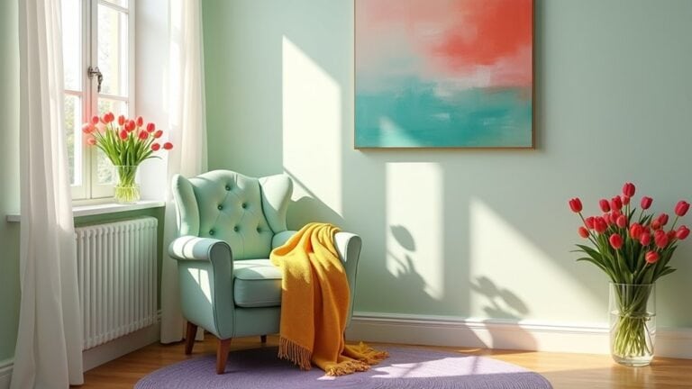
Spring color refreshes don’t need to be overwhelming. You can start small with nature-inspired palettes like cherry blossom pinks or meadow greens that actually boost your mood. Try swapping heavy winter textiles for lighter versions, or add pops of coral and mustard through accessories. Consider your room’s function—soothing lavenders work best in bedrooms while kitchens can handle lively citrus tones. Testing colors in different lighting will help you discover which spring palette truly transforms your space.
The Essentials
- Nature-inspired palettes featuring cherry blossom pinks, meadow greens, and earthy neutrals create fresh spring vibes in any space.
- Choose colors based on room function—calming pastels for bedrooms and energizing brights for living areas.
- Small color updates through pillows, vases, or artwork offer low-commitment ways to incorporate seasonal colors.
- Layer lighter textiles and gradually introduce spring colors while maintaining some winter elements for a smooth transition.
- Eco-friendly options like low-VOC paints and natural dyes provide sustainable ways to refresh your space with spring colors.
The Psychology of Spring Colors: How Seasonal Hues Affect Mood
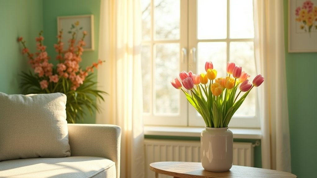
As winter thaws into spring, you’ll notice how the shifting colors around you subtly transform your mood and energy. It’s not just your imagination—there’s real psychology behind seasonal color symbolism and why certain hues make you feel more alive.
Soft greens can lower your stress levels, while sunny yellows might boost your optimism. Ever walked into a room with pale blue walls and felt your shoulders relax? That’s color psychology at work.
The emotional associations we have with spring colors are partly universal, partly personal. Maybe you feel energized by coral because it reminds you of that family vacation when you were twelve.
Try this: pay attention to which spring colors make you feel most at home. Those are the ones worth bringing into your space first.
Nature-Inspired Palettes: From Cherry Blossoms to Fresh Meadows
When you look outside your window during spring, you’re witnessing nature’s most spectacular color show. Why not bring those same invigorating vibes indoors?
Cherry blossom hues capture that fleeting magic of early spring. Try soft pinks paired with gentle creams and maybe a touch of lavender—it’s surprisingly versatile in bedrooms and living spaces. I’ve found that even small accents, like throw pillows in these tones, can transform a room.
For something more grounding, meadow green tones create that “just stepped outside” feeling. From sage to mint to deeper emerald, these colors work well in kitchens and dining areas where you want that fresh energy. You might start with something small like plant pots or tea towels if you’re hesitant about bigger commitments.
What outdoor palette speaks to you most?
Soft Pastels vs. Vibrant Brights: Choosing Your Spring Statement
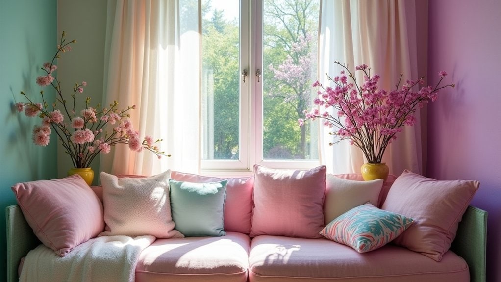
Your color choices can dramatically affect your mood, with soft pastels creating calm, relaxing spaces while lively brights energize and invigorate. You’ll want to match your palette to each room’s purpose—maybe serene blues and lavenders for bedrooms, but punchy yellows or coral for spaces where you entertain. When selecting your spring statement colors, consider how the light changes throughout the day in your space, as morning sun transforms even the most subtle hue into something unexpectedly beautiful.
Mood-Setting Color Psychology
The colors we surround ourselves with dramatically affect our mood and energy levels throughout the day. Understanding basic color meanings can help you make intentional choices for your home that support your emotional needs.
Blues and greens typically create calm, peaceful environments—maybe that’s why you feel more relaxed in your bathroom painted that soft seafoam color. Reds and oranges tend to energize spaces, which is great for dining rooms but might feel overwhelming in bedrooms.
Your emotional responses to certain colors are personal too. That yellow that makes your friend feel cheerful might remind you of a stressful workplace. Trust your gut reactions. When selecting your spring palette, consider how you want to feel in each space. Do you need more energy in your home office? More tranquility in your bedroom?
Room-Specific Palette Strategies
Springtime presents the perfect moment to reconsider your room’s color identity—whether you’ll embrace soft pastels that whisper or lively brights that make bold statements.
For bedrooms, try soothing lavender and sage color combinations that promote rest. I’ve found that cooler tones actually help me sleep better, though maybe that’s just me. Living spaces can handle more personality—sunny yellows paired with crisp whites create an energetic vibe without overwhelming guests.
Kitchens? They love those citrus pops against neutral backgrounds. My friend painted just one wall bright tangerine and completely transformed her breakfast nook.
When selecting your room aesthetics, consider how the light changes throughout the day. That perfect mint green might look… well, kind of odd when evening shadows fall. Always test swatches at different times before committing.
Room-by-Room Color Guide for Spring Refreshes
Revitalizing your home with seasonal colors doesn’t need to be complicated or expensive. Each room presents unique opportunities to play with fresh color combinations that shift the room atmosphere toward something brighter and more energizing.
For spring-ready spaces, consider these focused approaches:
- Living Areas – Add sunshine yellows and soft greens through throw pillows and affordable artwork. These instantly brighten spaces you spend most daytime hours in.
- Bedrooms – Layer in lavender and pale blue tones that promote rest while feeling seasonally appropriate. Maybe just new sheets or a lightweight throw?
- Kitchens – Introduce small pops of coral or mint through dish towels, placemats, or a new fruit bowl. These subtle changes actually catch your eye during daily routines.
What room will you refresh first?
Textiles and Accessories: Small Changes With Big Impact
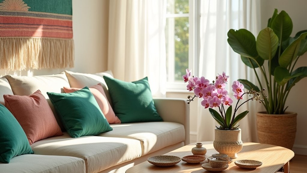
Just three well-chosen textiles or accessories can transform an entire room without breaking your budget or requiring major renovations. Think of swapping out throw pillows in lively spring hues, or adding a lightweight cotton throw with an unexpected pattern.
The magic happens when you play with textile textures—maybe pairing something rough like jute with softer velvet accents. I’ve found that creating varied accessory arrangements on coffee tables or mantels can really pull a refreshed look together. Try grouping objects in threes with different heights.
You know what worked surprisingly well in my living room? A bright teal vase that honestly didn’t match anything else, but somehow made the whole space feel intentional. What forgotten treasures might you already have that could breathe new life into your rooms?
Sustainable Color Updates: Eco-Friendly Ways to Transform Your Space
You’ll find low-VOC paints are a great starting point when you’re looking to update your space without harmful chemicals—they’ve come a long way in offering beautiful, rich colors that don’t compromise air quality. Natural dye alternatives can transform your textiles and soft furnishings, using ingredients like turmeric for yellows or berries for purples that you might actually have in your kitchen right now. These eco-friendly color updates aren’t just better for the planet, they’re often better for your health too, creating a space that feels both refreshed and responsible.
Low-VOC Paint Choices
When considering a color refresh for your home, the type of paint you choose matters as much as the color itself. Low-VOC (volatile organic compound) paints offer eco-friendly options without compromising on quality or color selection. I’ve used them in my own living room makeover and honestly couldn’t tell the difference from conventional paints—except for the lack of that strong paint smell!
Choose wisely by focusing on:
- Brand reputation – Look for established manufacturers like Benjamin Moore Natura or Sherwin-Williams Harmony that specialize in low-emission formulas
- Certification labels – EPA guidelines or Green Seal certification guarantee you’re getting truly low-VOC products
- Paint finishes – Most eco-friendly lines now offer the full range from matte to glossy, so you don’t have to sacrifice your design vision
Natural Dye Alternatives
Beyond low-VOC paints, there’s a whole world of natural dye alternatives that can bring fresh color to your space while staying true to eco-friendly principles.
Have you considered making your own botanical inks from plants in your garden? It’s surprisingly simple. I tried this last summer with some blackberries that stained everything anyway – might as well put them to good use! The dye extraction process typically involves boiling plant materials and reducing the liquid.
You can use these natural colorants for fabric updates like curtains, throw pillow covers, or even wall hangings. Maybe experiment with onion skins for golden yellows or avocado pits for soft pinks. Just remember, natural dyes often create more subtle, lived-in tones than their chemical counterparts, which honestly adds a certain warmth and authenticity to your space.
Mixing Winter Elements With Spring Freshness: Transitional Design Tips
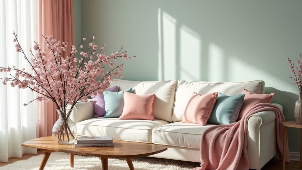
As winter’s cozy embrace gradually gives way to spring’s airy touch, finding balance between these contrasting seasons creates a smooth home change. You’ll want to maintain some winter elements while introducing fresh spring vibes—that’s what transitional decor is all about. I’ve tried this in my own living room and found it creates a wonderful seasonal harmony without feeling like you’re rushing the weather.
Try these simple approaches:
- Layer lighter textiles over heavier fabrics – swap dark throw blankets for lighter ones while keeping plush pillows
- Introduce fresh flowers alongside winter greenery like eucalyptus
- Update your color scheme gradually – add one spring color to your existing winter palette each week
What winter comfort pieces do you find hardest to pack away? Maybe keeping a few favorites helps the shift feel more natural.
Color Forecasts: This Season’s Trending Palettes From Design Experts
The design world’s top color experts have revealed their predictions for this season’s most influential palettes, and I’m genuinely excited about what’s trending.
This year’s color trends lean toward nature-inspired hues that bring the outdoors in—think soft sage greens paired with warm terracottas and muted blues. You’ll notice earthy neutrals are making a comeback, but with unexpected pops of coral or mustard yellow for dimension.
Benjamin Moore’s color of the year actually surprised me—it’s bolder than I expected, but somehow still feels timeless. Many design influences are coming from sustainable thinking, where colors reflect natural materials and processes.
What I love most is how adaptable these palettes are. You don’t need to repaint your entire home. Maybe just add a few new accent pieces in these trending tones to refresh your space.
Frequently Asked Questions
How Long Do Spring Color Trends Typically Last?
Spring color trends typically last 2-3 months. You’ll notice seasonal color psychology influences these cycles, as bright, invigorating palettes impact your mood positively. They’re most prominent March through May before summer trends emerge.
Can Spring Palettes Work in Homes With Limited Natural Light?
Yes, you can use spring palettes in dim spaces! Choose lighter shades with higher color saturation to compensate for limited natural light. Mirrors and strategic spring lighting will help reflect and enhance your fresh color choices.
Are There Spring Colors That Work Better for Rental Properties?
You’ll find rental-friendly options in removable wallpapers and decals featuring spring-friendly shades. Opt for neutrals with pastel accents, use colorful textiles, and incorporate plants to bring seasonal freshness without permanent changes to your space.
How Do Spring Colors Affect Home Resale Value?
Spring color psychology can boost your home’s resale value. Light, neutral spring tones attract more buyers, while current resale market trends show they can increase offers by 1-3% compared to bold, personalized colors.
Can Colorblind Individuals Still Enjoy Spring Palette Refreshes?
Yes, you can still enjoy spring palette renewals despite colorblindness. Focus on accessible design principles using texture, contrast, and patterns. Work with your specific color perception to create spaces that feel invigorating to you.
Final Thoughts
You don’t need a complete home makeover to embrace spring. Start small—maybe a few yellow throw pillows or that seafoam green vase you’ve been eyeing. Trust your instincts on colors that make you feel good. Your space should reflect you, not just design trends.
Remember, there’s no right or wrong way to refresh your home. The best palette is one that makes you smile when you walk through the door.

