Neutral design isn’t boring—it’s actually quite powerful. You’ll find that restraint often speaks louder than boldness when done right. Think layered textures that invite touch, thoughtful details that reward closer inspection, and carefully chosen elements that create visual breathing room. Your mind naturally feels calmer in these spaces too, making them perfect for both relaxation and creativity. The magic happens in the subtle nuances that might go unnoticed at first glance.
The Essentials
- Layering varied textures and materials adds depth and visual interest to neutral spaces without relying on bold colors.
- Mixing warm and cool neutral tones creates subtle tension that engages the eye within a restrained palette.
- Thoughtful placement of minimal yet meaningful objects tells a story that captivates more than decorative clutter.
- Neutral environments provide psychological benefits through sensory relief and mental clarity while remaining visually sophisticated.
- Quality lighting and carefully chosen tactile elements transform seemingly simple spaces into rich, inviting experiences.
The Power of Restraint in Modern Design
When you first encounter a minimalist space, what often strikes you isn’t what’s there, but what isn’t. That absence creates a kind of visual balance that’s hard to achieve with busy designs.
You’ve maybe noticed how a restrained color palette actually enhances your spatial awareness, letting you experience the room’s functional beauty more deeply. It’s like the design harmony speaks quietly but with greater emotional resonance.
Try this: stand in your most cluttered room, then imagine removing 70% of what you see. The aesthetic integrity would likely improve instantly.
What’s fascinating is how sensory engagement often increases in minimal spaces. Your eye can rest, wander, and appreciate details that might otherwise be lost in visual noise.
Finding Voice Through Simplicity
You’ll notice how the most powerful expressions often come wrapped in the simplest packages, like when you spot that one perfect black-and-white photo that somehow says everything. Your voice actually grows stronger when you strip away the unnecessary—when you’re not hiding behind complexity or ornate flourishes. Maybe the real art isn’t in what you add but in recognizing when restraint itself becomes your most authentic expression.
Power in Restraint
Though many believe forceful expression creates impact, the true power of communication often lies in restraint. You’ll notice this when you encounter someone who commands attention without raising their voice—they’ve mastered subtle expressions that speak volumes.
When you practice restraint techniques in your communication, you’re actually exercising greater control. Think about the minimalist choices you make in your daily life. Don’t they often feel more authentic?
Quiet elegance comes from knowing when to hold back, not when to add more. You might find that understated sophistication delivers your message more effectively than bold declarations. I’ve noticed discreet luxury often feels more substantial than flashy displays.
The refined simplicity of saying exactly what’s needed—nothing more, nothing less—creates an elegant minimalism that’s hard to ignore. Wouldn’t you rather be heard than merely noticed?
Less Becomes More
As contradiction often drives wisdom forward, embracing simplicity doesn’t diminish your voice—it amplifies it. When you strip away excess, what remains carries more weight. Think about those minimalist aesthetics that somehow feel more intentional than cluttered spaces.
You’ve probably noticed how the quietest person in a meeting gets everyone’s attention when they finally speak. That’s understated elegance in human form. It works the same in design, writing, even in how you dress.
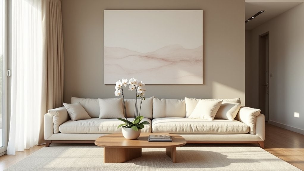
I remember redesigning my living room last year. Removed half the furniture, most of the wall art. Felt weird at first, maybe too empty? But now each piece matters more. The single painting commands attention it never got before.
Try pulling back. See what happens when you give your ideas room to breathe.
Texture as the New Statement Piece
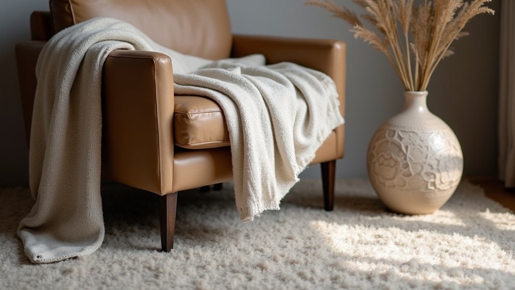
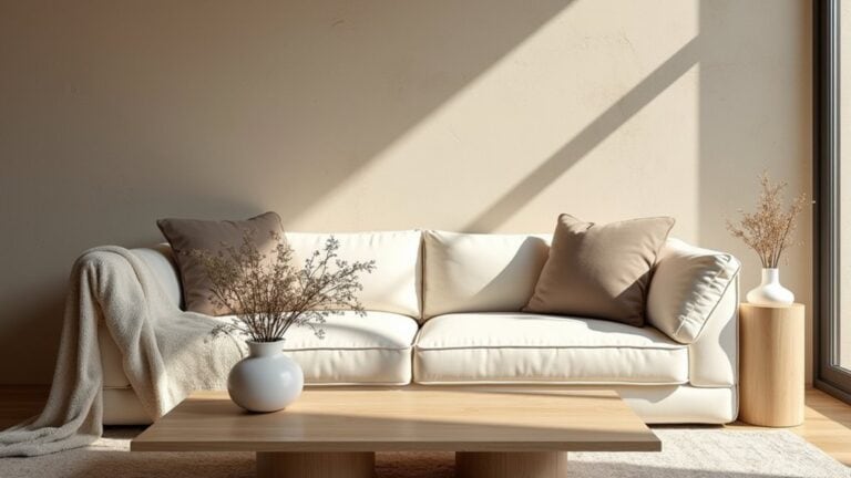
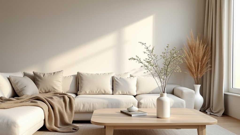
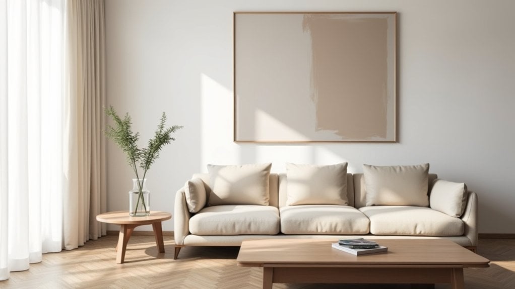
Texture has quietly revolutionized modern design while bold colors and patterns have been stealing the spotlight. You’ll notice how a monochromatic room suddenly comes alive when you introduce texture contrast through different materials. That flat beige wall? Add some grasscloth wallpaper, and it transforms completely.
Try thinking about your space regarding tactile layers rather than just visual elements. A chunky knit throw against smooth linen upholstery creates interest your eyes—and fingers—can appreciate. Maybe it’s the rough edge of a handmade ceramic bowl or the subtle ribbing on a matte vase that makes your neutral palette feel intentional rather than boring.
You don’t need bright colors when you can run your hand across a room and feel a story unfold beneath your fingertips.
The Psychology Behind Neutral Spaces
When you’re surrounded by neutral tones and uncluttered surfaces, your brain actually processes fewer competing stimuli, creating what designers call “sensory relief zones” in your home. You’ll notice how these calm spaces help clear mental fog—I’ve found that even ten minutes in my cream-colored reading nook feels like hitting a reset button for my thoughts. These environments aren’t just aesthetically pleasing; they’re working on your subconscious mind to promote mental clarity and reduce the decision fatigue that comes from visually busy surroundings.
Sensory Relief Zones
The concept of Sensory Relief Zones might sound fancy, but you’ve probably experienced their effects without realizing it. Remember walking into a quiet, softly lit room after being in a crowded mall? That immediate feeling of “ahh” is your brain thanking you for the sensory break.
You need these calming environments more than you think. Our brains process countless sensory experiences every minute, and sometimes they just need a timeout. Creating a neutral corner in your home gives your mind that necessary reset.
Try it yourself—dedicate a small area with minimal visual noise, comfortable seating, and soft textures. Keep technology and bright colors away. Even five minutes in this space can refresh your thinking and, well, maybe make your whole day a little more manageable.
Mental Clarity Effect
Neutral spaces don’t just feel good—there’s fascinating psychology behind why they work so well for our overloaded brains. When you’re constantly bombarded with information, a visually quiet environment actually helps your mind process thoughts more effectively.
You’ve probably noticed it yourself: enter a room with minimal distractions and suddenly your thoughts become less scattered. That’s mental clarity in action. Research suggests aesthetic simplicity creates cognitive space for better decision-making and creative thinking.
Try this—spend fifteen minutes in a neutral-toned room with clean lines and notice how your thoughts slow down. Maybe arrange a small work area with just essentials in view. Your brain doesn’t have to filter through visual noise, so you can focus on what matters.
I think we all need these mental breathing spaces, especially now.
Mindful Minimalism vs. Empty Aesthetics
Distinguishing between mindful minimalism and empty aesthetics requires more than just a cursory glance at surface-level design choices. When you embrace mindful aesthetics, you’re making intentional decisions that serve your living experience—not just creating a pretty picture for Instagram.
Look around your space. Does each item have purpose or meaning? That’s what minimalistic design should actually accomplish. You’re not just removing things; you’re curating with intention.
Empty aesthetics, though? That’s when you’ve stripped everything away without really thinking about what stays. The result feels a bit hollow, maybe even uncomfortable to live in.
I’ve visited homes that looked magazine-perfect but felt weirdly uninhabitable. You want the opposite—a space that breathes but still feels like yours. What stays matters more than what goes.
Balancing Warmth in Understated Environments
Many understated spaces fall into the trap of feeling sterile or cold—I’ve walked into minimal apartments that felt more like art galleries than homes. You don’t need to sacrifice warmth for simplicity though.
Try incorporating warm accents through inviting textures. Maybe a nubby wool throw on that sleek sofa, or layered neutrals in slightly different harmonious tones. I think the key is creating subtle contrasts that add interest without overwhelming the space.
Cozy minimalism isn’t an oxymoron. It’s about finding color balance that feels intentional rather than stark. Sometimes it’s just adding a single wooden element to bring warmth to an otherwise cool palette.
What makes your space feel inviting? Is it the quality of light, the softness underfoot, or perhaps the way objects feel in your hand?
Intentional Subtlety in a Bold World
You’ll often find that quiet power strategies work best when everyone else is shouting for attention. Creating meaningful impact doesn’t always require bold statements—sometimes it’s about what you deliberately leave out, giving viewers or listeners the space to draw their own conclusions. When you embrace the “less is more” approach, you’re actually inviting deeper engagement with what remains, making each element you do include work harder and matter more.
Quiet Power Strategies
In a world that constantly demands attention through grand gestures and bold statements, intentional subtlety often wields the most profound power. You’ve probably noticed how someone with quiet confidence can command a room without raising their voice. It’s that calm presence that draws people in rather than pushes them away.
Refined aesthetics don’t need to shout. Think of that perfectly tailored outfit with just one understated accessory, or maybe a minimalist room where every object serves both function and beauty. There’s invisible strength in holding back when everyone else is showing off.
Subtle elegance creates muted sophistication that lasts beyond trends. You know what I mean—that person whose gentle power feels more authentic than the loudest voice in the room. What could you accomplish by embracing this understated impact?
Less Is More
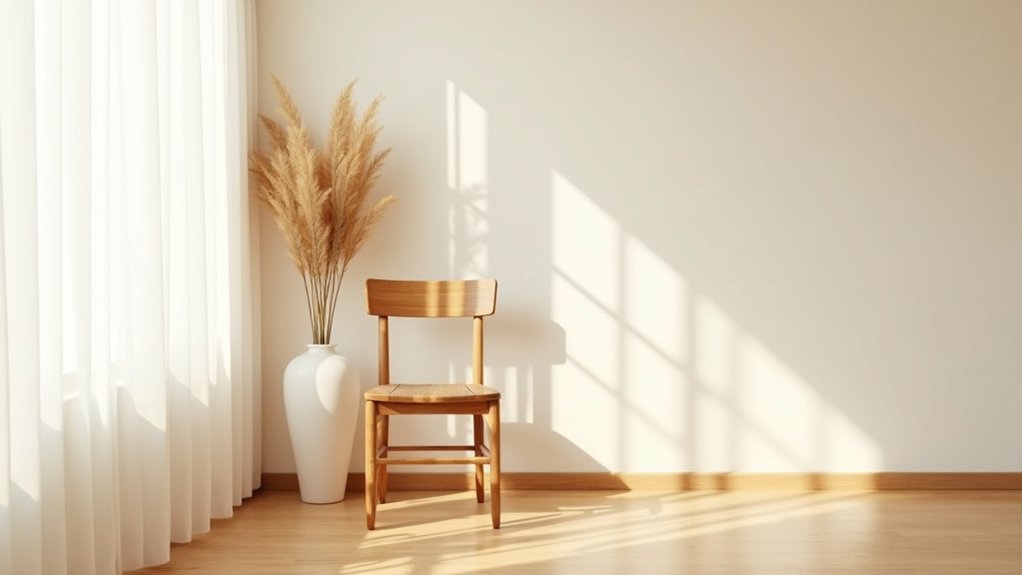
While our culture celebrates the extravagant, magnificent, and loud, deliberate simplicity often creates the most lasting impression. You’ll notice how a single, perfectly placed object in a room draws your eye more effectively than a cluttered collection. That’s understated elegance at work.
When you’re tempted to add more—more words, more design elements, more accessories—ask yourself if subtraction might actually strengthen your message. Minimalist aesthetics aren’t about emptiness but about intentional choices.
I remember visiting a friend’s apartment that felt incredibly peaceful. Nothing fancy, just thoughtful placement of a few quality items. The space felt… complete somehow?
You don’t need to shout to be heard. Sometimes a whisper, at the right moment, commands more attention than any grand gesture.
Space Creates Impact
Space between elements creates breathing room where meaning can flourish. When you intentionally create gaps in your design or communication, you’re actually highlighting what matters. Think about it—that moment of silence in a conversation often says more than words could.
The spatial qualities of emptiness aren’t just aesthetic choices; they’re powerful tools. You’ll notice how a sparsely decorated room feels more intentional than a cluttered one. Maybe it’s because our brains need that pause to process significance.
Try applying this impactful emptiness to your next project. Remove something instead of adding. Leave white space on your slides. Create pauses in your presentation. You might feel uncomfortable at first—like you’re not giving enough—but watch how people lean in, pay attention, and remember what truly matters.
The Quiet Impact of Thoughtful Details
Although often overlooked, thoughtful details create the most lasting impressions in both design and life. You’ll notice this when you enter a room where someone has taken time to add thoughtful accents—perhaps a perfectly placed vase or a textured throw that adds dimension without shouting for attention.
It’s those subtle touches that draw you in, making you want to linger a bit longer. Understated elegance isn’t about grand gestures but rather about intention. Maybe it’s the slight variation in texture on a wall, or cabinet hardware that feels good to touch.
What small details do you appreciate in spaces you love? These quieter elements often become the things you remember most, creating an atmosphere that feels considered rather than merely decorated.
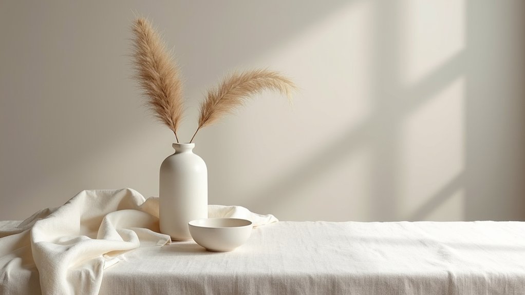
Creating Depth Within Neutral Palettes
When most people dismiss neutral palettes as boring, they’re missing the rich potential these subdued color schemes offer. You’ll find that depth exploration within neutrals actually creates spaces with lasting appeal and visual rest.
To build complexity in neutral rooms, try:
- Layering different textures – pair rough linen with sleek velvet or matte surfaces with glossy finishes
- Playing with temperature – mix warm ivories with cool grays to create subtle tension
- Incorporating varied tones – use shades that are slightly darker or lighter than your base
Color layering doesn’t require bold hues. Maybe it’s the slight shift between eggshell and cream that catches your eye, or the way shadows deepen taupe walls in evening light. I’ve found that neutral spaces reveal themselves slowly, rewarding those who take time to look closer.
Cultivating Confidence Through Refined Choices
True confidence in design rarely comes from bold statements or trendy choices, but rather emerges through intentional restraint and thoughtful curation. You’ll find that confidence building happens organically when you trust your instincts on subtle details others might overlook.
Start by editing ruthlessly. Remove anything that doesn’t serve a purpose in your space. Those refined choices—the perfectly weathered wooden side table or that textured throw in just the right shade—they speak volumes without shouting.
I’ve noticed that people who embrace neutrals often develop a sharper eye for quality. Maybe it’s because when you’re not relying on color to distract, you really have to contemplate form and texture. What if you approached your next design decision by asking not “Is this bold enough?” but “Does this feel authentically me?”
Frequently Asked Questions
How Do You Maintain Neutral Spaces With Children or Pets?
You’ll need child friendly decor and pet proof furnishings to maintain neutral spaces. Choose washable fabrics, sturdy furniture, and hidden storage solutions while sticking to a consistent color palette for harmony despite the chaos.
Can Subtlety Work in Small Apartments Without Feeling Cramped?
You’ll find subtlety thrives in small apartments through smart space enhancement. Choose light, cohesive color selections that flow between areas. Built-in storage, multifunctional furniture, and intentional negative space prevent cramped feelings entirely.
What’s the Cost Difference Between Bold and Neutral Design Approaches?
You’ll find bold design costs typically run higher due to statement pieces and custom elements, while neutral design costs tend to be more economical since you’re investing in versatile, timeless items that don’t need frequent updates.
How Do Seasonal Trends Affect Long-Term Neutral Design Investments?
Seasonal trends complement your timeless neutrals without demanding complete overhauls. You’ll save money as neutral foundations remain relevant while you’re making minor seasonal adaptations through accessories, textiles, or accent pieces that refresh spaces affordably.
When Does Subtlety Cross the Line Into Appearing Unfinished?
Subtlety crosses into unfinished territory when you’ve omitted design balance rather than refined it. You’ll know you’ve gone too far when subtle details disappear completely instead of creating intentional breathing space in your composition.
Final Thoughts
You’ve seen how neutral doesn’t mean lifeless—it’s about making space for what truly matters. When you strip away the noise, you’re actually creating room for intention. Try adding one texture instead of three colors next time. Notice how your eye rests differently.
Sometimes the boldest statement is the one that doesn’t shout. The quiet confidence of restraint? That’s what draws people in, makes them lean closer, wonder what else you might know.