To mix patterns successfully in your home, start with the rule of three: combine one dominant pattern with two supporting prints in varying scales. Keep them connected through a consistent color palette of 3-4 core colors. Create visual breathing room between patterns using solid neutrals, and don’t place similarly-sized prints next to each other. Try introducing patterns gradually with low-commitment pieces like throw pillows or blankets first. The key is balance—you’ll find your perfect pattern rhythm with a bit of experimentation.
The Essentials
- Follow the Rule of Three by using three different patterns in varying scales to create visual rhythm without overwhelming a space.
- Establish a clear print hierarchy with one dominant pattern as the focal point and complementary accent prints comprising 20-30% of visual space.
- Maintain color cohesion by using a shared color family with 3-4 core colors across different patterns for natural harmony.
- Create visual breathing room between patterns using solid-colored elements and neutral spaces that allow the eye to rest.
- Start with small, low-commitment pieces like throw pillows and blankets to experiment with pattern combinations before making larger investments.
The Rule of Three: Balancing Pattern Quantities
When it comes to mixing patterns in your home, the Rule of Three offers a practical framework that can help anyone—even decorating novices—create balanced, visually interesting spaces.
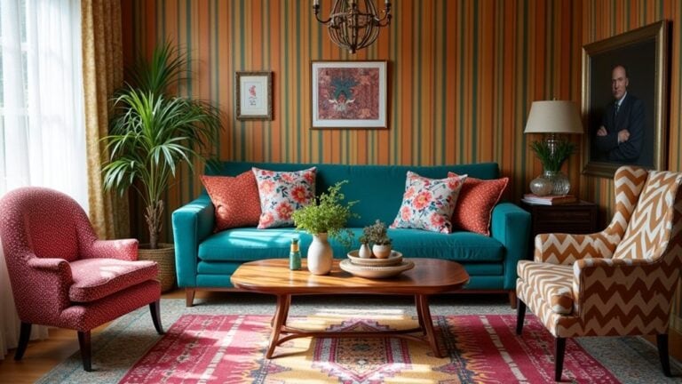
The idea is pretty simple: use three different patterns in varying scales within a single area. Maybe you’ll pair a bold floral with a subtle stripe and a small-scale geometric print. This creates visual rhythm without overwhelming the eye. You’ll want to think about pattern frequency too—how often each print appears in your space.
Try organizing patterns in cohesive clusters while maintaining proportionate placement throughout the room. Establish a clear print hierarchy where one pattern leads and others support. Layered textures and contrasting elements keep things interesting, while thoughtful color blocking ties everything together.
Have you noticed how the best-designed rooms never feel too perfect? That’s the Rule of Three at work.
Scale Matters: Playing With Different Sized Prints
When you’re mixing patterns in your space, the size of your prints can make or break the entire look. You’ll want to create a visual hierarchy by pairing one dominant, large-scale pattern with medium and smaller prints that complement rather than compete with each other. The breathing room between different scaled patterns matters too—maybe try spacing them throughout your room instead of cramming all your bold prints onto one wall or furniture piece.
Size Balancing Act
Frequently overlooked in pattern mixing is the crucial element of scale. You might love two patterns individually, but if they’re similar in size, they’ll compete for attention—trust me, I’ve made this mistake in my living room.
For harmony in your space, try combining a large-scale floral with a tiny polka dot or thin stripe. This print proportions strategy creates visual hierarchy that feels intentional, not chaotic.
Consider pattern placement too. Maybe use your bold, large-scale print on something with less surface area, like a throw pillow, while letting a smaller, subtler pattern cover more ground on curtains or a rug.
How do you know when you’ve got it right? Step back. If your eye can easily move around the room without getting stuck, you’ve nailed the balancing act.
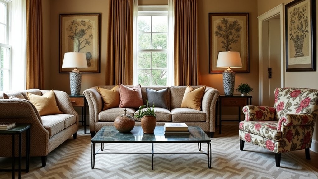
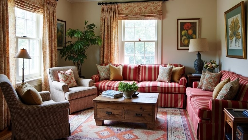
Dominant vs. Accent Prints
Although many homeowners struggle with pattern play, understanding the relationship between dominant and accent prints can transform your design from cluttered to curated. Think of your dominant print as the star of the show—it’s bolder, larger, and makes a clear statement in the room.
You’ll want to choose one dominant print you really love, then build around it with complementary accent prints that don’t compete for attention. Maybe you’ve got a gorgeous floral sofa? That’s your dominant print. Now add subtle striped pillows or a small geometric throw as accent prints.
I’ve found that limiting yourself to one dominant print per room works best. Your accent prints should take up roughly 20-30% of the visual space. What dominant print are you drawn to most in your home?
Space Between Patterns
Once you’ve selected your dominant and accent prints, the space between patterns becomes essential to achieving visual harmony. Think of pattern spacing as giving your eyes a place to rest between the visual excitement. You need those moments of calm—what designers call “visual breathing” room—to appreciate each pattern fully.
Try adding solid-colored elements between your patterns. Maybe a neutral throw pillow between two patterned ones, or a simple runner on a decorative table. I’ve found that even six inches of space can make all the difference in a room that feels thoughtfully designed versus chaotic.
What about your wall arrangements? When hanging patterned artwork, leave enough blank wall showing to frame each piece properly. You’ll notice the difference immediately—your patterns will sing rather than shout at each other.
Finding Your Anchor: Choosing a Dominant Pattern
When choosing your anchor pattern, start with scale as your primary consideration—a large, bold print often works best as the dominant element that other patterns will complement. You’ll want to guarantee color harmony by selecting patterns that share at least one common hue, which helps create a cohesive look even when mixing diverse designs. Remember to create breathing room between your patterns; this might mean adding solid-colored items or neutral spaces that give your eye a chance to rest and appreciate each pattern on its own.
Scale Matters Most
The foundation of successful pattern mixing starts with understanding scale. When you’re combining different prints, the variation in size creates visual interest while preventing chaos in your space. Think about print proportions as your secret weapon—pair a large floral with a medium stripe and maybe a small polka dot to establish clear pattern hierarchy.
You’ll want to avoid using patterns of similar scale together. I once made this mistake in my living room, and honestly, it was a bit dizzying. Instead, try combining a large-scale damask wallpaper with smaller geometric pillows.
What’s your room’s focal point? Start there with your boldest, largest pattern, then work down in scale as you move to smaller accessories. This creates a natural flow that guides the eye around your space.
Consider Color Harmony
Harmony creates the foundation for successful pattern mixing in any room. When considering color theory, focus on how complementary hues work together to create visual harmony. You’ll notice that warm tones (like reds and oranges) create a different emotional impact than cool tones (blues and greens). Maybe try starting with a monochromatic scheme—it’s often easier to manage while you’re getting comfortable with pattern play.
- Select a dominant color temperature that reflects the mood you want in your space
- Use varying color saturation levels within your pattern choices
- Stick to 3-4 core colors for better palette cohesion
- Include at least one neutral to give the eye a resting place
- Try laying out fabric swatches together before committing—you’ll quickly see what works
Space Between Patterns
Beyond color selection, successful pattern mixing depends on establishing visual hierarchy.
You’ll want to designate one standout pattern as your anchor piece—maybe a bold floral or geometric print that really speaks to you. This dominant element creates the foundation for your entire space.
Once you’ve chosen your anchor, consider pattern spacing throughout the room. Think about creating visual breathing room between competing prints. Too many patterns clustered together can feel chaotic, while thoughtful spacing lets each design shine.
I’ve found that breaking up patterns with solid-colored items works wonders. A neutral throw pillow between two patterned ones, or simple curtains against a wallpapered wall gives your eyes a place to rest.
How might you incorporate these spacing principles in your current space? Try starting with your favorite patterned piece and building outward.
Color Cohesion: The Thread That Ties Patterns Together
When mixing multiple patterns in your home, color serves as the invisible glue holding everything together. You’ll find that even wildly different prints can live harmoniously if they share a color family. Think about the color wheel when selecting patterns—complementary or analogous color schemes create natural print harmony without much effort.
- A navy blue geometric rug paired with floral curtains that incorporate the same blue tone
- Throw pillows in various patterns that pull from your room’s existing color palette
- Bedroom wallpaper with subtle stripes that echo the accent color in your bedding
- Kitchen backsplash tiles with patterns that reference the color of your cabinetry
- A gallery wall where mismatched frames work together because they share metallic finishes
Don’t worry about matching perfectly. Just make sure one or two colors run consistently throughout your space.
Pattern Personalities: Understanding Print Categories

When mixing patterns in your home, you’ll need to decide which prints should take center stage and which ones play supporting roles—think of that bold floral as your room’s star with subtle stripes as the backup dancers. You’ll create more visual harmony if you balance scale carefully, perhaps pairing a large-scale damask with smaller polka dots rather than competing statement prints. Combining structured geometric patterns with flowing organic designs often creates the most interesting spaces, like the way a rigid chevron throw pillow might unexpectedly complement your curvy, nature-inspired curtains.
Dominant vs. Supporting Prints
Prints and patterns in your home create the visual hierarchy that guides the eye. Think of dominant prints as the stars of your space—they’re bold, attention-grabbing, and set the room’s tone. You’ll want just one or maybe two dominant prints to avoid visual chaos. Supporting prints play backup, complementing rather than competing with your showstoppers.
- A large floral sofa commanding attention while subtle striped pillows provide balance
- Bold geometric curtains paired with solid-colored furniture and tiny dotted accents
- Statement wallpaper on one wall with quieter textural elements throughout
- Dramatic area rug anchoring a room filled with simpler, smaller patterns
- Striking art prints surrounded by subtly textured neutrals that don’t fight for focus
When mixing patterns, remember scale matters. Your dominant prints should vary in size from your supporting ones.
Scale and Proportion Balance
Scale serves as the secret ingredient in your pattern mixing recipe. When combining prints, you’ll want to vary the size of your patterns to create visual interest without chaos. Try pairing one large-scale print with medium and small-scale designs – this creates a natural hierarchy that guides the eye.
Most designers suggest following the 60-30-10 proportion ratio: 60% dominant scale, 30% secondary, and 10% accent patterns. I’ve found this works really well in living rooms where you might have large floral curtains, medium geometric pillows, and small striped accents.
The key is balance. Different scale types – oversized, medium, and miniature – need to complement each other. Maybe start with just two different scales if you’re unsure? You’ll develop an intuition for proportion balance with practice.
Geometric Meets Organic
Understanding print categories might seem intimidating at first, but I’ve found that thinking of patterns as having distinct personalities makes mixing them much easier. When you’re combining geometric shapes with organic forms, you’re creating visual contrast that adds depth to your space.
I think the key to pattern harmony is balance. You might love that bold chevron rug, but it needs the softness of a floral pillow to feel complete. Try pairing:
- Angular zigzags with flowing botanical prints
- Grid patterns alongside irregular watercolor splashes
- Structured stripes complementing free-form nature motifs
- Crisp polka dots mixed with abstract brushstrokes
- Precise geometric tile designs with imperfect hand-drawn elements
You’ll know you’ve struck the right balance when your room feels intentional rather than chaotic. Maybe start small—a geometric throw pillow on a chair with organic-patterned upholstery?
Neutral Ground: Creating Visual Rest Between Patterns
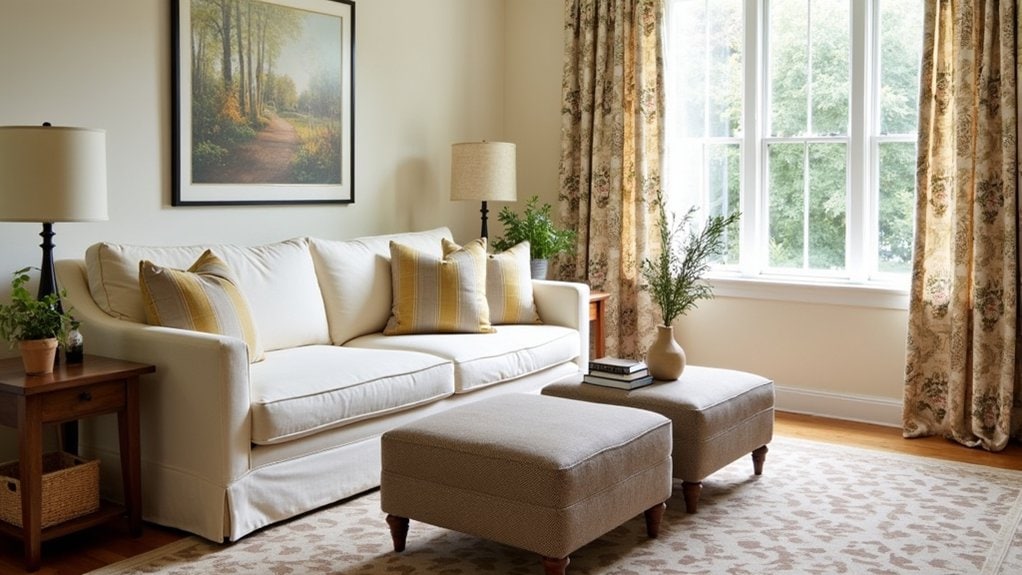
Three essential breathing spaces can transform a pattern-heavy room from chaotic to curated. First, consider solid neutral tones for your larger pieces – think sofas, bedding, or area rugs. These create anchors that let your patterns shine without competing.
Second, don’t forget about negative space. You need actual empty areas between your patterns where the eye can rest. I’ve found that leaving a wall blank or using a simple shelf display really helps maintain visual balance.
Third, try connecting pieces that bridge your patterns. Maybe a throw pillow that contains colors from both your floral curtains and geometric rug? This creates cohesion without adding more busy elements.
What’s your patterned room’s biggest challenge? Sometimes just rearranging what you already have creates the neutral breathing room you need.
Room-by-Room Strategy: Where Patterns Work Best
While every home has its own personality, each room serves a distinct purpose that can guide your pattern choices. You’ll want to evaluate the function and feel you’re aiming for in each space. For example, living room layers work best with 2-3 complementary patterns that create depth without overwhelming conversation areas. In your bedroom, aim for balance—maybe a bold headboard fabric paired with simpler bedding for restful vibes.
- Kitchen contrast: Try geometric tile backsplashes against solid countertops
- Bathroom accents: Small spaces handle bold patterns well—think shower curtains or wallpaper
- Dining area: Table linens offer low-commitment pattern opportunities
- Hallway harmony: Runners can add personality to connecting spaces
- Office organization: Subtle patterns help maintain focus while adding interest
Don’t forget playrooms—they’re perfect for throwing the rules out and embracing fun, mismatched patterns!
Textural Dimension: When Subtle Patterns Count
Not every pattern needs to shout for attention. Sometimes, the most sophisticated spaces rely on textural contrast rather than bold graphics. You’ll notice this in high-end interiors where subtle layering creates depth without overwhelming the eye.
Try incorporating a herringbone weave in your upholstery next to a linen with a barely-there stripe. Or maybe a matte wall covering with a slight crosshatch pattern against smooth painted trim. These quiet patterns add dimension while still feeling restful.
I’ve found that textural patterns work especially well in bedrooms and home offices where you want visual interest without distraction. They’re also perfect for people who get overwhelmed by too much pattern but still crave some variety.
When in doubt, run your hand across the surface—if you can feel the pattern, it counts as textural contrast.
Seasonal Transitions: Rotating Patterns Throughout the Year
As we move through different seasons, your home should evolve with the changing light and energy around you. Pattern rotation doesn’t require a complete overhaul—simply swap out a few key textile pieces to reflect seasonal themes without breaking your budget. You’ll notice how winter’s heavier patterns give way naturally to spring’s lighter motifs.
- Autumn: Rich plaids and woodland motifs in amber and burgundy tones
- Winter: Geometric patterns in deeper blues with metallic accents
- Spring: Botanical prints featuring tender greens and soft yellows
- Summer: Coastal stripes and tropical patterns with coral highlights
- Shifting months: Textural solids that bridge between seasonal themes
Want my advice? Keep your base furniture neutral and let your accessories do the seasonal talking. Maybe store off-season patterns in vacuum bags to save space?
Start Small: Low-Risk Ways to Experiment With Pattern Mixing

Three simple steps can transform your approach to pattern mixing without the anxiety of a full room commitment. First, try adding patterned throw pillows to a solid couch—they’re inexpensive and easily swapped if you change your mind. This basic pattern pairing gives you immediate visual feedback.
Next, experiment with smaller accessories like patterned picture frames or decorative boxes. These beginner tips help you test combinations without overwhelming your space.
Finally, consider a patterned throw blanket that complements your existing decor. I’ve found this works really well in living rooms where you’re not quite ready for bolder choices.
You’ll soon discover which pattern combinations feel right for your home. Maybe start this weekend with just one new patterned item?
Frequently Asked Questions
How Do I Incorporate Family Heirlooms Into Patterned Decor Schemes?
You’ll honor heirloom significance by placing family treasures as focal points where they complement your existing pattern harmony. Choose surrounding patterns that echo colors or motifs found in your cherished pieces.
Can I Mix Patterns When Decorating a Small Apartment?
Yes, you can mix patterns in small apartments! Keep pattern proportions balanced—larger in main areas, smaller in accents. Maintain color harmony by choosing complementary hues throughout. Don’t worry, it’ll make your space feel personalized and cohesive.
How Do Trends in Pattern Mixing Differ Across Cultures?
You’ll notice cultural influences shape pattern mixing trends dramatically. In Asia, you’ll find geometric harmony, while African styles embrace bold contrasts. Middle Eastern and Scandinavian regional styles reflect their distinctive cultural heritages.
What’s the Best Way to Photograph Mixed-Pattern Rooms Effectively?
You’ll capture mixed-pattern rooms best with natural lighting and stepped-back shots. Don’t rely on flash—open curtains instead. Use photography techniques like rule-of-thirds and varying angles to highlight pattern interactions effectively.
How Do I Explain My Pattern Choices to Skeptical Family Members?
When explaining your pattern rationale to skeptical relatives, share your design vision confidently, show how pieces complement each other, and invite family acceptance by highlighting how patterns create the cozy, personalized atmosphere you’ve envisioned.
Final Thoughts
You’ve got this pattern mixing thing down now. Trust your instinct—if you like how patterns look together, chances are they work! Remember, there’s no absolute right or wrong here. Start with smaller items, experiment with scale, and keep your color palette consistent. Maybe snap a quick photo to see how everything looks together. The best spaces tell your story, not someone else’s design rules.