As autumn settles in, you’ll find that deep forest greens, burgundy, and midnight blues create instant coziness in your home. These moody colors naturally encourage relaxation when daylight fades earlier. Try adding these tones through throw pillows, an accent wall, or textured blankets. Pair them with warm lighting (2700-3000K bulbs work best) and burnished copper or gold accents. You might be surprised how these rich hues transform your space into a sanctuary you’ll never want to leave.
The Essentials
- Burgundy accents add instant warmth through throw pillows, vases or textiles while pairing beautifully with navy or gold.
- Deep forest greens create tranquil, nature-inspired spaces that feel especially comforting as autumn evenings lengthen.
- Smoky blues and slate grays offer modern alternatives that create depth and serene retreat atmospheres.
- Layer rich textures like velvet, wool and leather in dark hues to enhance visual interest and physical comfort.
- Use warm metallic accents in copper, bronze or antique gold against dark walls to reflect light and add dimension.
The Psychology Behind Moody Color Palettes
While many people think color choices are just about aesthetics, they actually tap into something much deeper in our psychology. You’re not just picking a pretty shade when you opt for that deep burgundy throw pillow—you’re activating specific emotional responses tied to centuries of color symbolism.
Ever noticed how you feel calmer in a room painted deep blue? Or maybe more energized in a space with amber accents? That’s your brain responding to visual cues that evolved with us.
Dark, saturated colors create a sense of enclosure and safety as daylight fades earlier. You might find yourself drawn to forest greens, midnight blues, and rich plums this time of year. These colors don’t just look seasonal—they actually help shift your mind into autumn’s introspective energy.
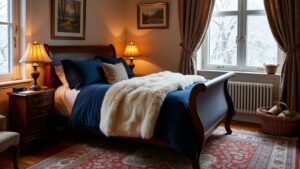
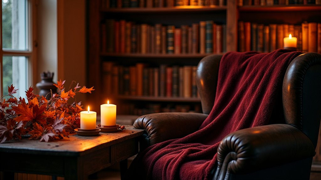
Burgundy: The Sophisticated Heart of Autumn
As autumn leaves reach their peak metamorphosis, burgundy emerges as perhaps the most sophisticated color in the seasonal palette. You’ll find this rich, wine-inspired hue brings instant warmth to any space while maintaining a certain elegance that other fall colors sometimes lack.
Try incorporating burgundy accents through small touches first—maybe a throw pillow or vintage glass vase. You’d be surprised how even minimal additions can transform your home’s entire mood.
For sophisticated pairings, burgundy works beautifully with navy blue, creating depth, or with warm golds that highlight its regal undertones. I recently added burgundy candles to my dining table, and honestly, dinner conversations feel more intimate somehow.
What makes burgundy special is how it captures autumn’s essence without feeling temporary—it’s seasonal yet timeless, cozy yet refined.
Deep Forest Greens for Natural Tranquility
You’ll find deep forest greens create that natural tranquility we all crave as autumn evenings grow longer. Try layering leafy textiles like velvet cushions against muted emerald accents—maybe a ceramic vase or two—to bring the soothing woodland essence indoors. Earthy wall treatments, whether it’s a painted accent wall or some textured wallpaper, can change your space into a cozy retreat that feels connected to nature’s autumn change.
Layered Leafy Textiles
Deep forest greens transform your living space into a sanctuary of natural tranquility when layered thoughtfully throughout textiles.
Try mixing leafy patterns of different scales – perhaps a bold fern print on an accent pillow against subtler, smaller leaf designs on throws. You’ll find these layered patterns create depth without overwhelming your room. I’ve noticed that varying textures works wonders too – velvet cushions paired with knitted blankets in complementary green tones make for cozy combinations that feel both sophisticated and comforting.
Don’t be afraid to introduce a few unexpected elements. Maybe a metallic thread running through a forest green throw? Or a plush moss-colored rug under your feet? These tactile experiences ground your autumn decor in something real and touchable. What textures speak most to you when the nights get longer?
Muted Emerald Accents
When the evenings grow darker, muted emerald accents bring an understated elegance to your home that feels both timely and timeless. These deep forest tones create a natural tranquility you’ll appreciate after hectic autumn days.
Incorporate muted emerald decor thoughtfully – not too much, just enough to create depth. I’ve found these work perfectly:
- Velvet throw pillows in deep emerald tones
- Stoneware vases with subtle green glazing
- Muted emerald accessories like picture frames or candleholders
- Woven throws with forest green threading
- Small emerald glass objects that catch evening lamplight
You don’t need to overhaul your space completely. Maybe start with just one or two muted emerald pieces and see how they transform your room’s energy. They’ll complement those layered textiles you’ve already added.
Earthy Wall Treatments
As autumn settles in around us, transforming our walls with earthy treatments can create a sanctuary-like atmosphere in any room. You’ll find deep forest greens particularly soothing – they mimic the natural world right when we’re spending more time indoors.
Try earth toned paints in warm terracotta or muted moss green. I painted my dining room last year and was surprised how much calmer I felt during family dinners.
Textured wallpapers add another dimension entirely. Maybe consider a subtle grasscloth in olive or a cork-inspired pattern that adds warmth without overwhelming. These textures catch light differently throughout the day, changing with the autumn sun’s angle.
What room would benefit most from this earthy makeover in your home? Sometimes even one accent wall can transform your entire space.
Creating Contrast: Balancing Dark Hues With Light
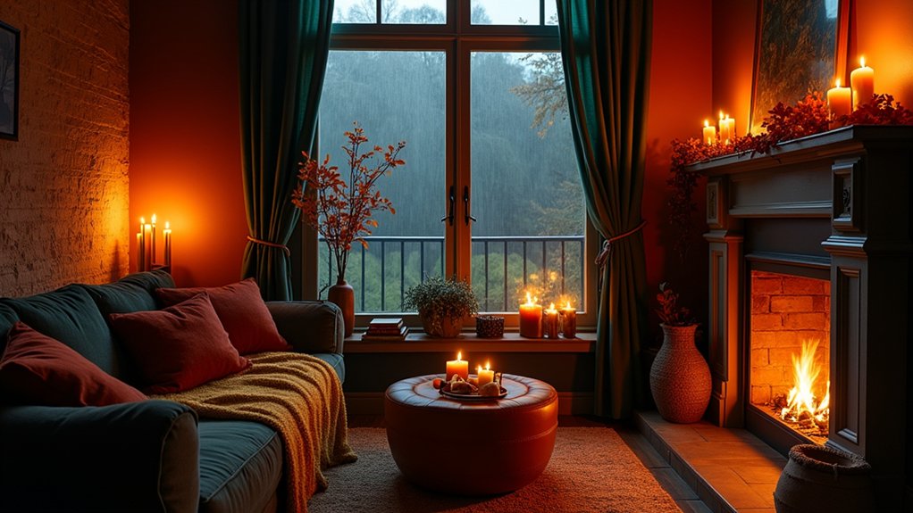
You’ll create the most enchanting autumn spaces when you master the dance between darkness and light, perhaps pairing midnight blues with creamy ivory accents or setting brass lamps against charcoal walls. Try balancing your room’s moody dark tones with strategic lighting—place candles on mantels, drape string lights across bookshelves, or position a bright reading lamp beside your favorite velvet armchair. These shadow play techniques won’t just highlight your dramatic color choices but will transform your space throughout the day, creating different moods as natural light fades into evening.
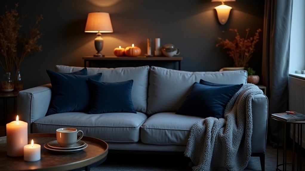
Midnight Against Ivory
The dramatic pairing of midnight blue against ivory creates perhaps the most striking contrast in autumn’s moodier palette. You’ll find this combination brings sophistication to any space while maintaining warmth. I’ve noticed midnight hues take on an almost velvety quality when placed against crisp ivory contrasts.
Try these ideas to incorporate this stunning pairing:
- Layer ivory throw pillows against a midnight blue couch
- Hang ivory curtains beside deep blue walls
- Place white candles in navy holders for dining tables
- Add cream-colored lampshades to dark blue lamp bases
- Paint picture frames ivory and display against navy accent walls
This balanced approach prevents your room from feeling too dark or heavy. Maybe it’s the way ivory softens midnight’s intensity, but there’s something about this pairing that feels both dramatic and comforting at once.
Dark Walls, Bright Accents
While many homeowners shy away from dark walls, embracing deep, moody colors can transform your autumn spaces into something truly magical. Dark color psychology suggests these rich tones actually create depth and intimacy, making larger rooms feel more cohesive during those long fall evenings.
You’ll want to balance these darker shades with strategic bright accent tips. Try adding cream throw pillows, metallic picture frames, or maybe even that vintage brass lamp you’ve been eyeing. I painted my office navy blue last year and honestly wondered if I’d made a mistake at first. But after adding some copper accessories and light wood elements? It’s now my favorite room.
What dark color are you considering? Forest green pairs beautifully with natural linens, while charcoal walls make white trim absolutely pop.
Shadow Play Techniques
When darkness settles both outside and within your home, mastering shadow play techniques becomes essential for creating visual interest and depth. Shadow silhouettes can transform ordinary spaces into enchanting environments that feel both intimate and expansive. You’ll notice how dramatic contrasts immediately add character to any room.
Try these approaches to play with light and shadow:
- Position directional lamps behind furniture to cast intriguing shapes
- Use candles at varying heights to create dancing shadow patterns
- Install dimmer switches to adjust lighting intensity based on mood
- Place mirrors strategically to multiply light sources and shadow effects
- Layer sheer curtains to diffuse light and create subtle shadow gradations
I’ve found that shadow play works best when you’re not afraid to experiment. Maybe start in a smaller space like your reading nook before tackling larger rooms?
Smoky Blues and Slate Grays for Modern Spaces
As autumn evenings grow longer, smoky blues and slate grays emerge as sophisticated alternatives to traditional fall palettes. These cooler tones create depth and tranquility in modern spaces while still maintaining that cozy autumn feel you’re craving.
Try painting an accent wall in a deep smoky blue—it’ll instantly transform your living room into a serene retreat. Maybe pair it with slate gray throw pillows or a textured wool blanket for those chilly nights. I’ve found that these colors work surprisingly well with warm wood tones too.
Don’t forget about lighting. These moody colors absorb light differently than brighter hues, so you’ll want to add extra lamps or candles to create that perfect ambiance. What areas in your home could use a touch of these sophisticated, calming shades?
Burnished Metallics: Copper, Bronze, and Antique Gold
If you’re looking to add warmth and dimension to your autumn decor, burnished metallics might be your perfect answer. These rich, textured finishes create a cozy glow that feels just right when the evenings get darker and cooler.
I’ve found that copper accents work beautifully against dark walls – maybe a few hammered vessels grouped on a mantel? The way they catch the light is pretty magical.
- Bronze finishes on lighting fixtures create warm, ambient illumination
- Antique gold picture frames add vintage charm to family photos
- Copper accents like candleholders reflect flickering flames
- Metallic textures on throw pillows catch and scatter light
- Mixed metal vases (try grouping different heights) for seasonal branches
What room would you transform first with these burnished touches?
Layering Textures With Dark Color Schemes
You’ll find that layering rich fabrics like velvet, wool, and leather transforms those dark color schemes into something you can actually feel, not just see. Consider mixing three or four different textures on your sofa—maybe a chunky knit throw against smooth velvet pillows—to create depth that catches subtle shadows when you’re working with limited light. Your ambient lighting choices become really important here too, with wall sconces and table lamps at varying heights helping to highlight those textural elements while keeping that cozy autumn mood intact.
Rich Fabric Combinations
When autumn darkness settles in, layering rich textures becomes essential for creating those moody, cozy spaces we all crave. You’ll want to combine fabrics that add depth while complementing those darker color schemes we talked about earlier.
Try these combinations for instant warmth:
- Velvet curtains paired with weathered leather—this contrast adds sophistication without trying too hard
- Chunky knit pillows against smooth linen upholstery
- Wool throws draped casually over velvet chairs—maybe in burgundy or forest green?
- Silk accent pieces catching subtle lamplight on darker surfaces
- Nubby bouclé paired with glossy ceramic accessories for textural play
Don’t worry about perfect matching. Sometimes the most interesting rooms happen when you mix unexpected textures. I’ve found that running your hand across different fabrics before buying helps you sense how they’ll feel together in your space.
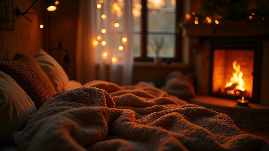
Ambient Lighting Tricks
Beyond fabric choices, lighting transforms how those moody autumn textures actually feel in your space. You’ll want to layer ambient light sources rather than relying on harsh overhead fixtures. Maybe place a few brass or copper lamps at different heights around the room—I’ve found this creates depth when paired with dark walls.
Try warm glow techniques like installing dimmer switches (seriously, they’re game-changers) or using amber-tinted bulbs in reading lamps. Small tea lights in smoky glass holders add that perfect flicker without being too “holiday” specific.
Have you considered string lights draped loosely behind sheer curtains? They cast the softest shadows across textured throws. When you’re curled up with a book on those chilly evenings, you’ll notice how the lighting actually enhances those rich colors you’ve chosen.
Moody Accent Walls Without Overwhelming Spaces
Creating a moody accent wall doesn’t mean sacrificing the airiness of your space or plunging it into darkness. In fact, a well-planned dark wall can actually make your room feel larger and more interesting. I’ve found that limiting your moody colors to just one wall creates drama without overwhelming the space.
Try these approaches for balance:
- Choose deep jewel tones rather than true black for a rich yet livable feel
- Pair moody murals with lighter furniture to create contrast
- Add metallic accent accessories that reflect light across the dark surface
- Position your accent wall opposite a window to maintain natural brightness
- Incorporate texture through wallpaper or paint techniques for dimension
You’ll be surprised at how a single dark wall can anchor your space while still letting it breathe.
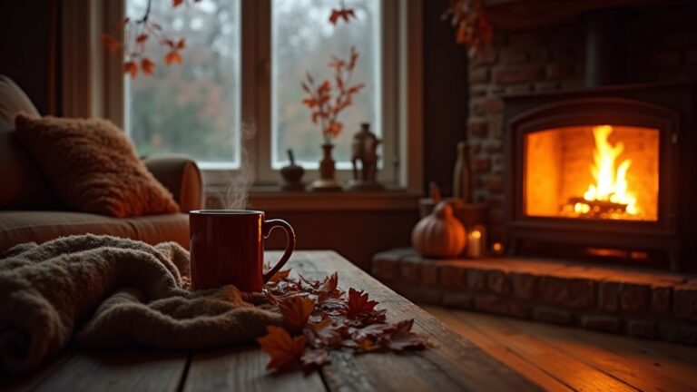
Lighting Strategies for Rich-Toned Rooms
Although deep, rich colors create incredible depth and personality in a room, they demand thoughtful lighting to truly shine. You’ll want to layer your lighting sources—I’ve found that relying on just overhead lights can make dark walls feel oppressive rather than cozy.
Try placing ambient fixtures at different heights around the room. A combination of floor lamps behind seating areas, table lamps on side surfaces, and maybe even wall sconces can prevent shadows from swallowing your space.
Pay attention to color temperature too. Warmer bulbs (2700-3000K) complement autumn-inspired palettes beautifully, while cooler lights might clash with those earthy tones. I think dimmers are absolutely essential in rich-toned rooms—they let you adjust the mood based on time of day or activity.
What feeling are you trying to create in your space?
Textile Choices for Maximum Seasonal Coziness
When the days grow shorter and temperatures drop, your textile choices become essential for creating that perfect autumn sanctuary. This season’s textile trends favor rich textures that invite touch and create visual warmth. You’ll want to embrace fabric layering—it’s not just practical for those chilly evenings, but also adds dimension to your space.
Consider these cozy textile additions:
- Chunky knit throws in mustard yellow or burnt orange
- Velvet pillows that catch the light (I think deep plum looks amazing)
- Natural wool area rugs to warm up wooden floors
- Flannel or brushed cotton bedding that feels soft against your skin
- Woven table runners with subtle metallic threads
Maybe mix unexpected fabrics together—like pairing raw linen with silky velvet. What textures make you feel most at home when autumn winds blow?
Small-Space Solutions With Deep Color Palettes

Even in the smallest apartments, deep color palettes can transform your space from cramped to cozy during autumn. You don’t need massive rooms to play with burgundy, forest green, or navy—try painting just one wall or adding deep hue accessories like plum throw pillows or amber glass vases.
Small space furniture with dark finishes actually works well in tight quarters. That charcoal loveseat might seem counterintuitive, but paired with strategic lighting, it creates depth rather than shrinking the room.
I’ve found that layering textures helps too. Maybe add a rust-colored Ottoman that doubles as storage? Or hang a mirror across from your darkest wall to balance things out.
The trick is moderation—too many dark elements and you’ll feel like you’re living in a cave. What spots in your home could use some moody color love?
Transitioning Your Space From Summer to Autumn
As summer fades into memory, your home deserves a seasonal refresh that doesn’t require a complete overhaul. The change to autumn gives you a chance to play with warmer, moodier tones that bring comfort as evenings grow longer.
Creating color harmony between your existing space and seasonal decor is easier than you might think. You probably already have some perfect transitional pieces tucked away.
- Swap bright cotton throws for chunky knits in amber, rust or forest green
- Introduce deeper accent pillows on sofas and beds
- Replace summer florals with dried arrangements and textured branches
- Layer area rugs for added warmth and dimension
- Incorporate candlelight with amber or smoky glass holders
Have you considered how lighting changes your color experience? As natural light dims earlier, warm-toned bulbs enhance those cozy autumn vibes you’re after.
Frequently Asked Questions
How Long Do Moody Color Trends Typically Last?
You’ll notice moody color trends typically last 2-3 years in home décor. Color psychology shows they’re cyclical, with seasonal trends influencing how long they remain popular. They’ll eventually return after fading.
Can Moody Colors Work in Homes With Children and Pets?
Yes, you can use moody colors with kids and pets! Choose darker, washable paints that hide stains, pair with child-friendly palettes for balance, and select pet-proof materials that resist scratches and maintain their rich appearance.
What’s the Budget Range for a Complete Moody Color Makeover?
You’re looking at $500-$3,000 depending on your space size. You’ll find budget friendly options in paint ($100-300) while color palette selection costs more when including textiles, accessories, and professional design services.
Do Moody Autumn Colors Affect Home Resale Value?
Moody colors can impact your home’s market appeal positively or negatively. While they showcase your personality through color psychology, you’ll want to contemplate neutral options if you’re planning to sell soon.
How Do Moody Colors Photograph in Real Estate Listings?
You’ll find moody colors often photograph dark in listings without proper lighting techniques. They can evoke strong psychological responses—some buyers feel cozy, others confined. Color psychology impacts how inviting your space appears online.
Final Thoughts
Don’t worry too much about rules when bringing autumn’s moodier palette into your home. Trust what feels good to you—maybe that burgundy throw really does make your evening cup of tea feel more special.
You’ll know you’ve got it right when you actually want to stay in on those chilly nights. Just add what works, subtract what doesn’t, and yeah—those darker colors might actually make your space feel bigger, not smaller.