You don’t need to stick with traditional orange for your Thanksgiving table. Try navy and gold for modern elegance, woodland greens with mushroom neutrals for an earthy feel, or dramatic jewel tones for luxury. Winter whites with natural textures create warmth, while lavender and silver offer unexpected sophistication. Coastal blues bring a beachy vibe, and monochromatic grey with yellow pops works beautifully in contemporary homes. These fresh palettes will transform your holiday gathering without losing that festive spirit.
The Essentials
- Navy and gold color scheme offers sophisticated elegance with metallic accents and rich contrast.
- Lavender and silver create an unexpected pairing with dried flowers and reflective mercury glass votives.
- Woodland-inspired decor with mushroom neutrals and natural elements brings the outdoors to your table.
- Coastal blues and sandy neutrals provide a refreshing alternative to traditional autumn colors.
- Moody jewel tones with velvet textures create a dramatic and luxurious Thanksgiving atmosphere.
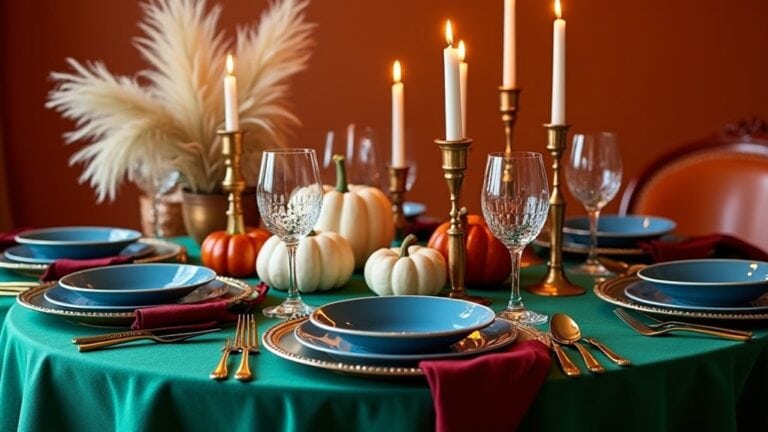
Elegant Navy and Gold: A Sophisticated Twist on Tradition
While traditional orange and brown tones have their place at the Thanksgiving table, an elegant navy and gold color scheme offers a modern, sophisticated alternative that still feels festive.
You’ll find it’s surprisingly easy to incorporate navy accents throughout your setting. Try navy cloth napkins paired with gold napkin rings, or maybe a navy table runner with subtle gold embellishments along the edges.
I’ve found that gold charger plates really pop against a navy backdrop, creating this rich contrast that feels special but not over-the-top fancy.
Add a few metallic gold candlesticks of varying heights and perhaps some navy blue glass votives scattered down the center. Don’t feel you need perfect symmetry – sometimes the most inviting tables have a bit of natural imbalance to them. What navy and gold elements might you already have around your home?
Woodland Greens and Mushroom Neutrals
If navy and gold bring a touch of elegance to your holiday table, a woodland greens and mushroom neutrals palette offers something entirely different – a natural, earthy aesthetic that connects your gathering to the outdoors.
Create woodland tablescapes by layering natural elements like pine branches, eucalyptus, and moss runners across your table. Maybe add some pinecones or acorns you collected with the kids last weekend. I think small wooden bowls filled with mushroom accents work perfectly here – try incorporating oyster mushrooms or even ceramic mushroom figurines as place card holders.
The beauty of this theme is its simplicity. Linen napkins in soft beige or taupe, coupled with matte stoneware plates, complete the organic feel without trying too hard. What natural elements might you add from your own yard?
Moody Jewel Tones for a Dramatic Harvest Table
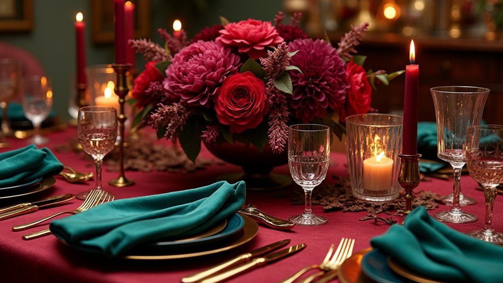
For your most striking Thanksgiving table yet, you’ll want to embrace dark purples that create an almost regal backdrop for your feast. You can layer different velvet pieces—maybe napkins or even a table runner—to add rich texture that guests won’t be able to resist touching. The contrast between these moody jewel tones and your gleaming silverware creates a dramatic harvest table that feels both luxurious and surprisingly cozy.
Dark Purples Dominate
Darkness captivates the Thanksgiving table this season as rich plums, deep eggplants, and moody mulberries take center stage. You’ll notice how these sultry shades create an atmosphere that feels both sophisticated and cozy at once.
Try layering dark floral arrangements with blackberries and plum-colored dahlias nestled among deep green foliage. Maybe add some unexpected elements like black grapes cascading from centerpieces? I love how they catch the candlelight.
Rich fabrics really make this palette work. Think velvet napkins in aubergine or plum table runners that add texture against simpler dinnerware. You could even use dark purple taper candles—they’re surprisingly easy to find nowadays.
What I find interesting is how these deeper tones actually make your gathering feel more intimate. Have you considered how color affects your guests’ experience?
Velvet Texture Mix
While purple tones create depth, adding velvet elements takes your Thanksgiving table to another level of sensory richness. That plush texture creates an instant feeling of luxury that guests can’t help but touch.
Try layering a deep emerald velvet tablecloth beneath your settings – I did this last year and everyone kept running their hands across it throughout dinner. It somehow made the food taste better, I swear.
Velvet napkin rings are another easy way to incorporate this texture. You can find them in jewel tones or even make your own by wrapping velvet ribbon around plain wooden rings.
Don’t go overboard though. Too much velvet can feel a bit heavy. Maybe balance it with some lighter elements like clear glassware or metallic accents?
Winter White With Natural Textures
You’ll find that a winter white palette creates a surprisingly warm Thanksgiving table when you incorporate plenty of natural textures. Try layering cream-colored linens with wheat-colored placemats, then add in elements like unbleached cotton napkins, white pumpkins, and maybe some birch candle holders for that cozy neutral feel. The beauty of this approach is how your organic materials—pinecones, dried grasses, even bleached branches—stand out against the clean backdrop while still feeling completely connected to the season.
Cozy Neutral Centerpieces
When neutrals and natural textures come together, they create centerpieces that feel both elegant and approachable for your Thanksgiving table.
Try clustering cream-colored candles at varying heights with sprigs of dried wheat and small white pumpkins. The combination brings rustic charm without overwhelming your dinner setting. You might even add pinecones or acorns gathered from your yard—I did this last year and my guests loved touching the different textures while we ate.
Woven table runners or unbleached linen napkins can anchor your centerpiece with minimalist elegance. Maybe place a few river stones alongside some bare branches in a clear vase? It’s unexpected but feels so intentional.
What makes these neutral arrangements special is how they complement your food rather than compete with it. Your turkey and cranberry sauce will truly pop against this calming backdrop.
Layered Organic Elements
For a truly memorable winter white tablescape, layering organic elements creates depth that a single-note display simply can’t achieve. Try placing bleached pinecones alongside unpolished stone candle holders, or maybe scatter small birch branches between linen napkins and ceramic plates.
You’ll want to incorporate subtle layered textures that guests can actually feel when they sit down. I’ve found that mixing materials—like rough jute placemats under smooth porcelain—creates interesting contrast without breaking your neutral palette.
Don’t worry about perfect symmetry. Let organic colors from wheat stalks or dried mushrooms (yes, really!) bring warmth to the arrangement. Last year I added some dried artichokes and everyone kept touching them throughout dinner. What unexpected natural elements could you incorporate that might spark conversation at your table?
Lavender and Silver: An Unexpected Seasonal Pairing
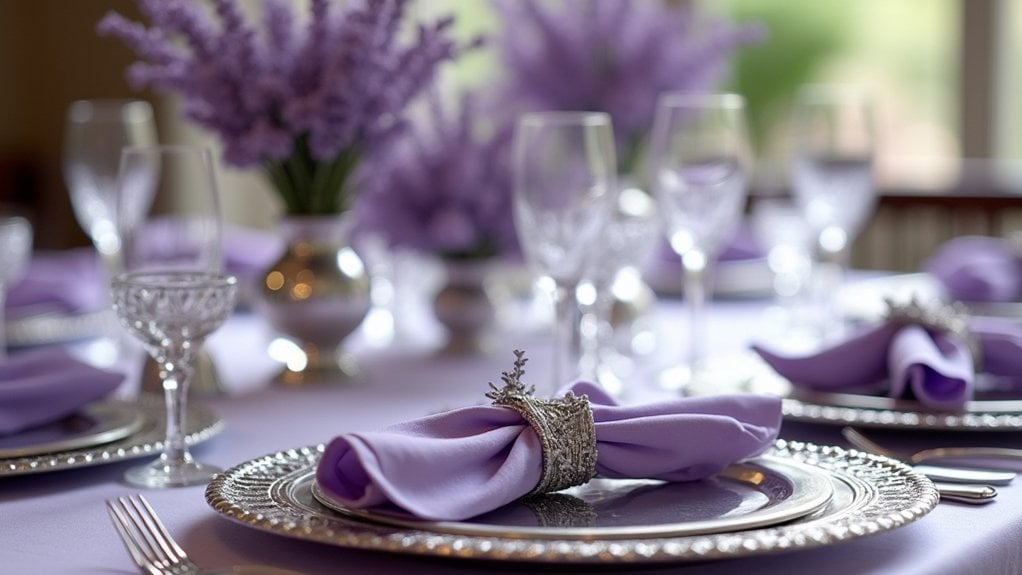
While traditional autumn palettes embrace warm oranges and deep reds, lavender and silver create a stunning alternative that’s both sophisticated and unexpected on the Thanksgiving table.
Try placing sprigs of dried lavender in small silver vases down your tablescape, or tuck lavender accents into napkin rings for a subtle touch of color. I’ve found that silver tableware reflects candlelight beautifully against the soft purple tones – it’s honestly magical at night.
You don’t need to go overboard. Maybe start with silver chargers under white plates, then add just a few lavender elements. Last year, I mixed in some silver mercury glass votives with lavender ribbon and everyone kept asking how I thought of it.
What unexpected color combinations have you been drawn to lately?
Deep Burgundy and Copper for a Rich Alternative
Speaking of unexpected pairings, I’m actually even more excited about the deep burgundy and copper combination I’ve been experimenting with this season. It’s so rich and warm—perfect for those chilly November evenings when everyone’s gathered around the table.
You can start with a simple burgundy tablecloth, maybe add some deep burgundy accents like napkins or small floral arrangements. I found these amazing copper candleholders at a vintage shop last week that catch the light in this incredible way.
What I love most is how this palette feels festive without screaming “Thanksgiving!” You know? It’s sophisticated but still cozy.
Have you tried using copper serving pieces? They add this subtle glow that makes everything—even just simple roasted vegetables—look more special.
Coastal Blues and Sandy Neutrals for a Beach-Inspired Gathering
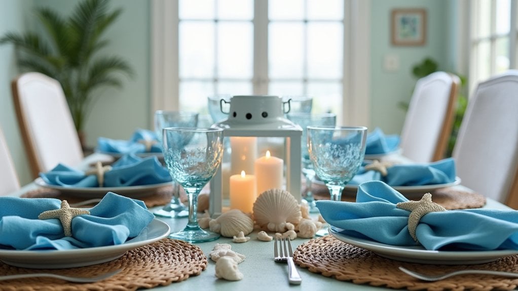
Why limit our Thanksgiving palettes to traditional autumn colors when coastal-inspired blues and sandy neutrals can create such a revitalizing alternative?
If you’re near the shore (or just wish you were), try incorporating oceanic hues that remind you of summer relaxation. Layer a tablecloth in soft aqua with natural linen napkins and maybe add some beachy accents like small glass bottles filled with sand or shells as place card holders. I’ve found that hurricane lamps with blue candles surrounded by collected seashells make stunning centerpieces.
For ocean inspired decor that doesn’t feel too summery, mix in copper or brass elements to warm things up. You can use driftwood as a base for serving platters or scatter a few dried starfish among white pumpkins. Don’t you think there’s something peaceful about bringing the coast to your Thanksgiving table?
Monochromatic Grey With Pops of Yellow
Although many Thanksgiving color schemes lean into warm oranges and reds, there’s something incredibly sophisticated about a monochromatic grey palette punctuated with sunny yellow accents. You’ll create a modern, unexpected holiday table that still feels festive but in a fresh way.
Try these ideas to bring this elegant color scheme to life:
- Layer various shades of grey tableware – maybe start with charcoal plates, add lighter grey salad plates, and top with dove-grey linen napkins
- Incorporate yellow accents through candles of different heights scattered down your tablescape
- Add a centerpiece of white pumpkins with sprigs of yellow flowers or berries for that perfect pop of sunshine
I think this color combination works especially well in contemporary homes with neutral décor. Your guests will definitely notice something different this year.
Frequently Asked Questions
How Can I Incorporate Meaningful Family Heirlooms Into Non-Traditional Color Schemes?
You’ll create elegant heirloom displays by selecting complementary non-traditional colors around your pieces. Try coordinating color schemes that highlight each heirloom’s unique character while maintaining visual harmony throughout your thoughtfully designed arrangement.
What Budget-Friendly Alternatives Exist for These Designer Color Palettes?
You’ll find budget-friendly decor at thrift stores, dollar shops, and craft centers. Mix affordable tableware with natural elements like pinecones or leaves. DIY cloth napkins and candle holders add personal touches without breaking the bank.
How Do I Transition These Table Designs for Christmas Gatherings?
You’ll easily transform your table by swapping autumnal elements for holiday decor in reds and greens. Add pine sprigs, holly berries, and metallic accents to your existing centerpieces for instant festive centerpieces that celebrate Christmas.
Which Color Schemes Work Best for Small Dining Spaces?
For small dining spaces, you’ll want light color pairings like soft blues with cream or pale greens with white. These combinations create airy ambiance while space enhancement comes from minimalist centerpieces and multi-functional table accessories.
Can These Non-Orange Themes Still Incorporate Traditional Thanksgiving Foods?
You’ll find traditional Thanksgiving foods look stunning on colorful platters regardless of your theme. Arrange turkey, cranberry sauce, and pies in festive arrangements that complement any color scheme you’ve chosen for your dining space.
Final Thoughts
Breaking free from traditional orange offers a revitalizing take on your Thanksgiving celebration. You’ll notice how guests respond differently to unexpected colors that still feel seasonal and warm.
Try just one of these palette ideas this year—maybe navy and gold, or those woodland greens I love. Your table doesn’t need to scream “fall” to feel festive and welcoming.
What colors might reflect your personal style while still honoring the gathering’s spirit?