Your bookshelf probably looks fine. But “fine” isn’t really what you’re going for, right? There’s a difference between books just existing on shelves and a bookshelf that actually feels intentional. Most people don’t realize how much a few small decisions can change the whole look. The good news is you don’t need a design degree or a bigger budget. You just need to know what actually works — and what’s quietly making your shelf look cluttered.
The Essentials
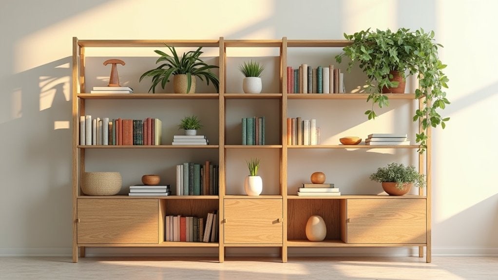
- Limit your color palette to two or three tones, using existing room colors as a guide for cohesive bookshelf styling.
- Arrange decorative objects in odd-numbered groupings of three, varying heights and textures to create natural visual balance.
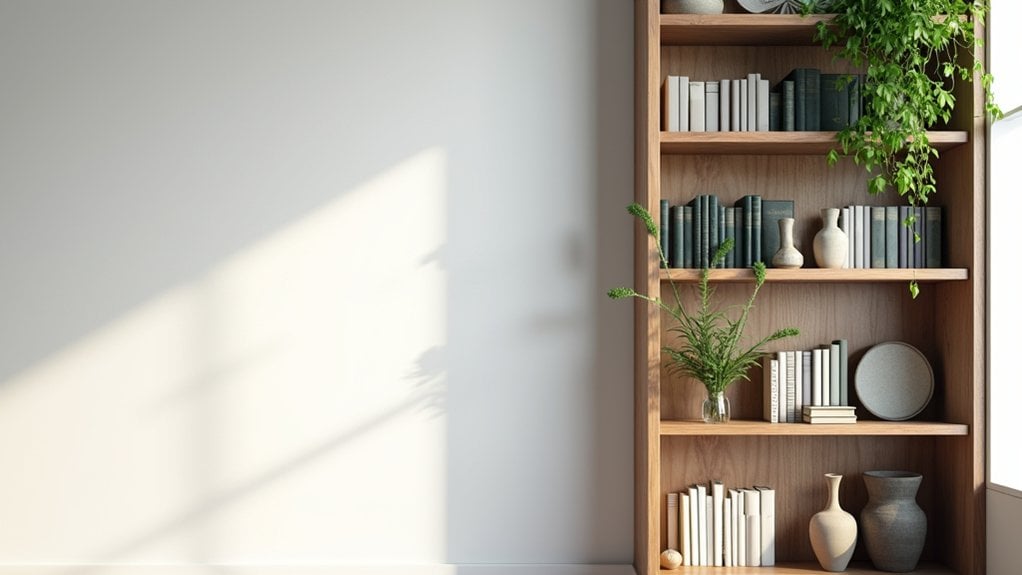
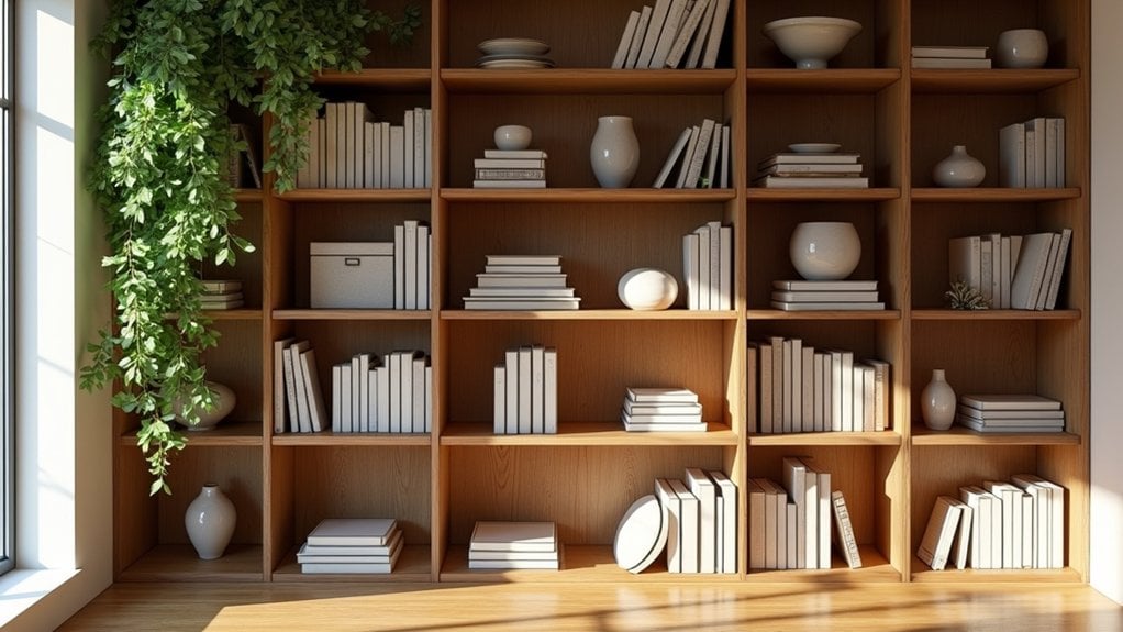
- Fill only 60–70% of shelf space with books, leaving intentional gaps to prevent clutter and improve visual clarity.
- Incorporate plants, decorative pots, and greenery to add life, texture, and dimension alongside your book arrangements.
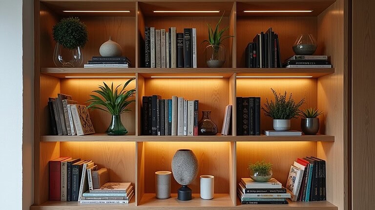
- Use LED strip lighting or small spotlights with warm color temperatures to enhance ambiance and highlight displayed items.
Start With a Clear-Out and Fresh Eyes
Before you even think about arranging anything, you need to pull everything off the shelves completely.
Seriously, everything.
This first step delivers real decluttering benefits — you’ll immediately notice what you actually have versus what’s just been sitting there collecting dust. Shelf clarity starts here. A fresh perspective is almost impossible when you’re working around existing clutter.
Once the shelves are empty, take a moment. What’s your organizing strategy? What do you actually want people to feel when they look at this space?
Think about visual impact, space enhancement, and what kind of personal touch reflects you. Design inspiration can come from simply seeing blank shelves — the empty space tells you what it needs.
Don’t rush this part. It matters more than most people realize.
The Rule of Three That Makes Bookshelf Styling Look Effortless
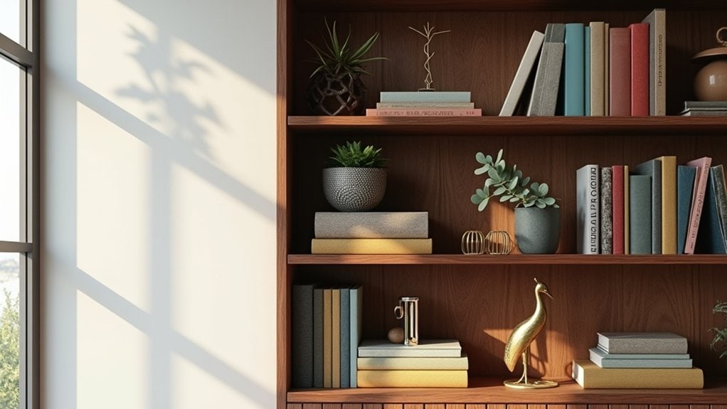
If you’ve ever stared at a shelf and thought something felt off but couldn’t quite name it, it might just be a grouping problem. The rule of three is a simple idea—objects arranged in odd numbers, especially threes, tend to look more natural and balanced than pairs or even groupings. Try pulling three things together on one shelf section, maybe a tall vase, a shorter stack of books, and something small in front, and see if the arrangement suddenly starts to feel more intentional.
Understanding the Rule
There’s a simple principle that most professional stylists lean on when arranging a bookshelf, and it’s called the rule of three.
Basically, your eye finds groups of three more visually interesting than two or four. It’s a core design principle, and it quietly influences visual hierarchy across interiors, graphic layouts, even color theory.
When you apply it to shelves, you’re grouping decorative accents, books, or personal touches in sets of three. Different heights, varied textures, maybe one functional piece mixed in.
Spatial awareness matters here too. You don’t want three identical items—that just reads flat. Think about shelf themes and how functional aesthetics can still feel personal.
Does every shelf need it? Not exactly. But it’s a reliable starting point when something feels off.
Grouping Objects Effectively
Grouping objects on a shelf sounds straightforward, but it’s one of those things that trips people up more than it should.
Start with three items. Not two, not four — three. There’s something about that number that creates visual hierarchy without making the shelf feel crowded or sparse. Think about object pairing within the group too. A tall vase, a medium book stack, a small figurine. Different heights, different textures.
Now ask yourself — do the three items feel related? They don’t need to match exactly, but they should have something in common. Color, material, mood.
Here’s where people go wrong: they group randomly and wonder why it looks off.
Vary your groupings across the shelf. Don’t repeat the same formula in every section.
Balancing Heights and Textures
Three heights on a single shelf can make or break the whole thing.
Think tall, medium, and low — that’s your foundation for height variations that actually work. A stack of books creates one level, a small plant adds another, and maybe a candle or figurine sits lower. That’s lively layering without overthinking it.
Texture contrasts matter too. A smooth ceramic next to a woven basket creates visual interest almost instantly. Are you mixing enough materials, or does everything feel a little too similar?
Your focal points should feel intentional but not stiff. Playful accents — something unexpected — can keep shelf aesthetics from looking too staged.
Harmonious arrangement and cohesive look don’t mean matching. Design principles actually encourage you to mix things up carefully.
How to Balance Height, Color, and Texture on Every Shelf
When you’re arranging a shelf, the three things that’ll make or break the look are height, color, and texture — and honestly, most people focus on one and forget the other two.
Height variation keeps your eye moving. Color harmony ties everything together without making it feel too matchy. Texture contrast adds depth — rough next to smooth, matte next to shiny.
Think about object placement before committing. Are your tallest pieces clustering on one side? That’s a shelf arrangement issue, not a styling win.
Good arrangement strategies don’t require perfection. They require intention.
Visual balance isn’t about symmetry — it’s about weight. Apply basic design principles and your aesthetic appeal naturally improves.
Styling techniques like grouping in odd numbers, varying heights, and mixing textures? Those actually work.
How Many Books Should Actually Be on a Bookshelf?
Here’s something most people get wrong — they think a bookshelf needs to be packed to look good.
It doesn’t.
Aesthetic balance actually depends on what you *leave out* as much as what you put in. Too many books creates visual noise. But too few feels empty and cold.
So what’s the right book quantity? Honestly, it depends. A rough starting point:
- Fill about 60–70% of each shelf with books
- Leave breathing room between groupings
- Mix vertical and horizontal stacks
- Keep one or two open gaps intentionally
That last one feels wrong at first. You’ll want to fill it. Resist that.
Ask yourself — does every book need to be here, or are some just taking up space?
Should You Arrange Books by Color, Genre, or Size?
Once you’ve figured out how many books you actually want on display, the next question is how to organize them—and honestly, it’s not as straightforward as it sounds. Color arrangement looks really striking in photos, but it can make finding a specific book genuinely frustrating day-to-day. Genre organization keeps things practical, though mixing in some size-based groupings might help everything actually fit without things looking weirdly cramped or unbalanced.
Color Arrangement Pros and Cons
Arranging your books by color looks undeniably striking—but it comes with a real trade-off.
The color impact is immediate. Guests notice it. It creates aesthetic harmony across your shelf that’s honestly hard to achieve any other way. But can you actually find what you’re looking for?
Here’s what you’re working with:
- Pro: Creates a visually cohesive, gallery-like display
- Con: Makes locating specific books genuinely frustrating
- Pro: Works beautifully in spaces where decor matters more than function
- Con: Forces you to remember a book’s spine color, not its title
If your shelf is mostly decorative, color arrangement makes total sense. If you actually read and pull books regularly, it might drive you a little crazy.
Genre Organization for Functionality
Genre organization is probably the most practical approach if you actually use your bookshelf regularly. If you’re grabbing books often, knowing exactly where your mysteries or cookbooks live saves real time.
Grouping by genre themes means your shelf works for you, not just looks good. That’s functional aesthetics at its best—something that serves a purpose while still looking intentional.
But here’s something worth thinking about: do your genre themes actually reflect how you use your books, or just how you categorize them in your head?
Fiction, nonfiction, reference, cookbooks—these are obvious starting points. You might find some categories overlap, though. A memoir that reads like fiction, for instance. Don’t overthink those edge cases. Just pick a home for it and move on.
Size-Based Shelving Strategies
Functionality isn’t the only reason people rearrange their shelves, though. Size actually matters more than you’d think when it comes to shelf arrangement and aesthetic balance.
Consider your shelf dimensions carefully before placing anything. Here’s a practical approach:
- Group taller books together to create natural height variation without looking chaotic
- Use spacing techniques between objects to manage visual weight more intentionally
- Match object proportions to your shelf depth so nothing looks awkward or crammed
- Alternate size variety across sections to keep things visually interesting
You want functional design, not just pretty design. Small books next to oversized ones can look unintentional. Sometimes that works, sometimes it doesn’t. Trust your eye, but also measure things first. Shelf depth changes everything about how objects actually sit.
Stack Books Horizontally to Instantly Improve Your Bookshelf
One of the easiest ways to break up the visual monotony of a bookshelf is to stack some of your books horizontally instead of standing them all upright.
Horizontal arrangement adds instant visual interest without much effort. Try grouping two or three books flat, then placing a small object on top — a candle, a plant, whatever you have. That little shift in shelf depth changes everything.
Book stacking also helps with decorative balance. You’re not just filling space anymore. You’re creating unique displays that feel intentional. Got a few books with colorful spines? Stack those together for easy color pops.
Functional aesthetics don’t have to be complicated. Sometimes one horizontal stack is enough to make an entire shelf feel considered rather than just… full.
How to Choose a Color Palette for Your Bookshelf
Color can make or break how your bookshelf looks, and honestly, it’s worth thinking about before you start arranging anything.
A few color selection tips that actually help:
- Pick two or three colors max — more than that gets chaotic fast
- Use your room’s existing colors as a starting point
- Group books by color to create visual order without much effort
- Add one neutral tone to balance stronger colors out
Mood influence is real here. Warm tones like terracotta or rust feel cozy and lived-in. Cooler tones like navy or sage feel calmer, more collected.
You don’t have to be rigid about it. Sometimes one unexpected color just works, and you kind of know it when you see it.
How to Arrange Decorative Objects Without Crowding Your Books
Decorative objects can genuinely make a bookshelf feel more personal, but three or four poorly placed pieces can quickly make the whole thing feel cluttered and hard to look at.
So think about decorative object placement before you just start putting things wherever.
Group smaller objects together—a candle, a small plant, a little dish—rather than spreading them randomly across every shelf. That gives your eye somewhere to rest.
Ask yourself: does every shelf actually need something decorative on it?
Minimalist styling works well here. Leave some shelves mostly to the books. Let the spines do something.
One or two shelves with objects, the rest fairly clean. That contrast actually makes the decorated shelves feel more intentional, not less.
You don’t need to fill everything.
Why Empty Space on Your Shelves Actually Works in Your Favor
There’s something that feels almost counterintuitive about leaving parts of your bookshelf empty on purpose—like you’re not using the space correctly, or you haven’t finished yet.
But negative space actually does real work for you. It gives your eye somewhere to rest.
Empty areas create visual balance by preventing everything from competing for attention at once. Here’s what intentional empty space helps you do:
- Highlight the objects you actually care about
- Make your shelf feel curated instead of cluttered
- Draw attention to color or texture nearby
- Give the whole arrangement room to breathe
You don’t need to fill every inch. Sometimes a bare stretch of shelf makes the things beside it look more deliberate—more considered. Does your shelf feel crowded right now?
Add Life to Your Bookshelf With Plants and Greenery
Adding a plant or two to your bookshelf can make the whole thing feel more lived-in, which is honestly the goal. You don’t need a green thumb—something like a pothos or a small succulent works fine and won’t demand much from you. Try tucking a trailing plant near the edge of a shelf so it drapes down naturally alongside your books, and see how that changes the feel of the space.
Choosing the Right Plants
Plants can genuinely transform a bookshelf, but not every plant is going to work in that kind of space.
Think about what you’re actually dealing with—low light, limited depth, and maybe forgetting to water for two weeks straight. That narrows things down, honestly.
Here are four plants worth considering:
- Succulent varieties — low-maintenance, great for texture mix, and they don’t mind irregular plant care
- Trailing plants — pothos or string of pearls add height variation and natural movement
- Small ferns — nice color contrast against darker books
- Air plants — easy shelf placement, no soil needed, fit well in stylish pots
Do the plants you’re considering actually suit your light situation? That question matters more than aesthetics.
Styling Plants With Books
Once you’ve picked the right plants, figuring out where they actually go on the shelf is a whole different thing.
Different plant types need different shelf placement. A trailing pothos creates vertical interest when it cascades down from an upper shelf. Something compact with strong texture contrast, like a cactus, works better tucked beside books without crowding them.
Think about color harmony too. Deep green leaves next to warm-toned book spines can shift the whole aesthetic balance of a shelf.
Decorative pots matter more than people realize. A terracotta pot reads differently than white ceramic.
Consider growth habits before committing to a spot. Some plants expand fast.
Seasonal greenery lets you refresh the look without redesigning everything. And yes, some plants genuinely help with air purification, which feels like a bonus worth mentioning.
Low-Maintenance Greenery Options
If you’re not great at keeping plants alive, that’s actually fine—there are some genuinely forgiving options that hold up well on a bookshelf without much attention.
- Succulents — A solid succulent selection works great in minimalist pots and barely needs watering.
- Air plants — Air plant options need no soil, which honestly makes them easier to style anywhere.
- Low light plants — Pothos or snake plants handle low light plants situations pretty well, including trailing vines over shelf edges.
- Faux greenery — If you want pet safe options without the guesswork, faux greenery has gotten surprisingly realistic.
You can also swap in seasonal accents occasionally to keep things feeling fresh. Does the shelf get much natural light? That’ll narrow things down pretty quickly.
How to Style a Bookshelf When Books Overflow
When books start taking over your shelves, it’s tempting to just keep stacking and hope for the best. But book overflow doesn’t have to look chaotic. You can actually use it to your advantage.
Try leaning a few books horizontally to create visual hierarchy. Stack them sideways, then place something small on top — a plant, a candle, a little object that adds personal touches without cluttering things up.
Creative solutions matter here. Think about curated collections rather than everything all at once. Pull out books by color or size. That alone creates aesthetic balance without much effort.
Functional decor like small baskets nearby can hold the extras. Unique accents break up the repetition. What would you keep visible versus tucked away?
How to Style Built-Ins, Floating Shelves, and Bookcases
Each type of shelf brings its own set of challenges. Built-in benefits include structure and permanence, but they can feel rigid. Floating features give you flexibility—move things around without much commitment. Bookcase styles vary wildly, so know what you’re working with first.
Here’s how to approach each one:
- Lean into shelf themes and visual storytelling to create intentional moments
- Add personal touches like photos or small objects you actually care about
- Try a minimalist approach with functional decor that earns its place
- Do seasonal updates using creative accessories to keep things feeling fresh
What story do you want your shelves to tell? That question shapes everything. Don’t overthink it, but don’t ignore it either.
The Best Lighting Tricks to Elevate Any Bookshelf
Lighting’s one of those things people don’t really think about when styling a bookshelf, but it makes a surprisingly big difference. You’ll want to contemplate where you’re placing your light source—whether that’s a small clip-on spotlight, a puck light tucked under a shelf, or even a slim LED strip running along the back. Layering different types of light, like mixing ambient room light with a more focused shelf light, adds depth and keeps everything from looking flat.
Strategic Shelf Lighting Placement
Lighting can completely change how a bookshelf feels, and honestly, most people don’t think about it until everything else is already arranged. But placement matters more than the fixture itself.
Here’s where to start:
- Tuck LED strips along the back edge to eliminate shelf shadows and create soft ambient lighting behind your objects
- Aim a small spotlight downward from the top shelf for focused spotlight effects on displayed items
- Set decorative lamps nearby to layer light sources and help with mood enhancement without overwhelming the space
- Choose the right color temperature — warmer tones feel cozier, cooler tones read more modern
What’s the vibe you’re actually going for? That answer should drive every lighting decision you make from here.
Layering Light for Depth
Once you’ve figured out where your light sources go, the next step is actually layering them — and that’s where most people either get it really right or kind of miss the mark.
Ambient lighting handles the overall glow, but accent lighting does the real character work. Think small decorative lamps beside books, or warm tones running along lower shelves. That combination creates mood enhancement without feeling forced.
Layered textures actually respond differently to light — rough linen, glossy ceramics, matte wood. You’re not just illuminating objects, you’re creating stylistic contrasts that make things feel intentional.
Shelf illumination works best when it feels uneven, honestly. Not every section needs equal brightness.
Does your current setup lean too uniform? That might be worth reconsidering before anything else.
Common Bookshelf Styling Mistakes That Ruin the Look
Even small styling choices can quietly work against you, and a few common mistakes show up again and again on bookshelves that just don’t look quite right.
Watch out for these four common issues:
- Overcrowded shelves — cluttered arrangements make everything compete for attention
- Ignoring proportions — mismatched decor and mismatched colors throw off the whole visual balance
- Lack of focal points — inconsistent themes and overly uniformity leave the eye wandering nowhere specific
- Neglecting maintenance — poor lighting and dust quietly undermine even well-styled shelves
Does your shelf actually have a clear spot your eye lands on first?
Overcrowded shelves are probably the most common issue. Pull a few things off. Really. Negative space isn’t wasted space — it gives everything else room to breathe a little.
How to Maintain Your Bookshelf Styling Between Rearranges
Keeping a bookshelf looking good between major rearranges mostly comes down to small, consistent habits rather than big efforts.
Dust your shelves every couple of weeks. It sounds basic, but skipping it really does make everything look dull fast. When you’re putting a book back, take a second to check if it’s sitting where it belongs.
Shelf maintenance strategies don’t need to be complicated. Just a quick scan once a week keeps things from slowly drifting into chaos.
Seasonal updates are worth thinking about too. Swapping one or two objects for something that fits the current season keeps the shelf feeling fresh without a full redo.
Do you actually notice when something shifts out of place? Honestly, building that habit matters more than any single styling choice.
Frequently Asked Questions
Can I Style a Bookshelf Without Spending Money on New Décor?
Yes, you can! Try DIY decor by upcycling books you already own—stack them horizontally, remove dust jackets for a cleaner look, and repurpose household items like candles or plants to create a stylish, designer-inspired display.
How Do I Style a Bookshelf in a Small or Narrow Space?
You’ll optimize a small bookshelf by using vertical arranging to stack books upright and draw the eye upward. Incorporate space-saving solutions like multi-purpose items and minimalist décor to keep the area feeling open and uncluttered.
What Materials Work Best for Bookshelf Shelves to Hold Heavy Books?
For heavy books, you’ll want solid hardwoods like oak or maple. Choose wood types with at least 1-inch shelf thickness to prevent sagging. Plywood’s also a strong, budget-friendly option that’ll handle the weight well.
How Do I Keep My Bookshelf Looking Styled With Young Children Around?
Use lower shelves for creative storage with bins and baskets for kids’ toys and books. Apply childproofing tips like securing the shelf to the wall. Reserve upper shelves for your styled, decorative items they can’t reach.
Can a Bookshelf Be Styled Effectively Without Any Decorative Objects?
Yes, you can absolutely style a bookshelf without decorative objects by embracing minimalist aesthetics. Arrange your books by color or size, and let functional design shine through intentional spacing, creating a clean, visually striking display.
Final Thoughts
Styling your bookshelf doesn’t have to be perfect on the first try. Move things around. Step back. Move them again. You’ll start noticing what feels right and what’s just taking up space.
The goal isn’t to copy a designer’s shelf exactly — it’s to build something that actually makes sense for your home and your stuff.
Start small. Pick one shelf. See how it goes from there.