You’ve probably stood in your living room wondering why something feels off, even when the furniture’s arranged perfectly. The missing piece might be simpler than you think—it’s often about finding that one accent color that ties everything together. But here’s where most people stumble: they either play it too safe with beige variations or go overboard with colors that clash. There’s actually a methodical way to approach this decision that considers what you already have.
The Essentials
- Analyze your existing furniture, rugs, and artwork to identify the current neutral color scheme and underlying warm or cool tones.
- Use complementary colors for high contrast or analogous colors for harmony, limiting accent colors to maximum three to avoid visual chaos.
- Test color combinations with fabric swatches, paint samples, and poster boards in different lighting conditions throughout the day.
- Distribute accent colors intentionally using larger pieces for primary accents and smaller accessories for secondary colors with visual breathing room.
- Start with temporary solutions like throw pillows or removable wallpaper before committing to major purchases or permanent color changes.
Understanding Color Theory Basics for Interior Design

When you’re staring at paint swatches or fabric samples, color theory might seem like something only designers need to worry about. But honestly? You don’t need an art degree to make it work for you.
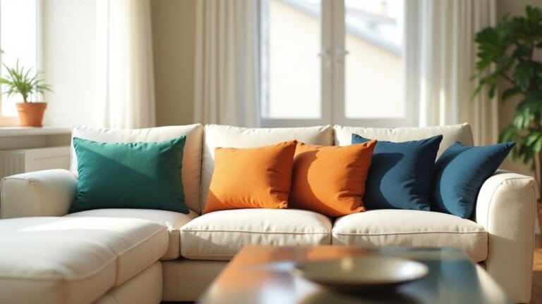
The color wheel is your starting point. It shows how colors relate to each other and helps you avoid those “something feels off” moments. Complementary colors sit opposite each other on the wheel—think blue and orange, or red and green. They create contrast without being jarring.
Your overall color scheme sets the mood for your space. Analogous color combinations use neighbors on the wheel, like blue, blue-green, and green. These feel harmonious and calming.
What kind of energy do you want your room to have?
Assessing Your Current Living Room Color Palette
Before you start shopping for throw pillows or that statement artwork you’ve been eyeing, you need to take a hard look at what’s already happening in your living room. Walk around and really notice your existing furniture. What’s the overall color story here?
Maybe you’ve got a beige sofa with walnut wood tables. Or perhaps there’s a gray sectional paired with white walls. Whatever your neutral color scheme looks like, write it down. Actually grab a pen and paper—this helps.
Look at your curtains, rugs, and any art you already have. These elements contribute to your color palette too. You might discover you’ve been unconsciously gravitating toward warm tones, or maybe everything skews cool and crisp.
Working With Neutral Base Colors as Your Foundation

Neutrals act as the steady foundation that lets you experiment with bolder choices later. When white walls or beige serve as your dominant color, you’re creating space for accent pieces to truly shine. Think of neutrals as your main color backdrop—they won’t compete with that lively throw pillow or artwork you love.
Solid colors work best for neutral foundations:
- Warm whites create a cozy, inviting atmosphere
- Cool grays offer modern sophistication
- Beige brings classic warmth to any room
- Cream adds softness without being stark
- Charcoal provides dramatic contrast opportunities
You’ll find that neutral bases make decorating decisions easier, not harder. When your walls aren’t fighting for attention, you can swap out accent colors seasonally or whenever inspiration strikes. What neutral shade feels right for your space?
Bold Jewel Tones for Dramatic Impact
After you’ve established your neutral foundation, jewel tones offer the perfect opportunity to introduce serious visual punch into your space.
Think emerald green throw pillows on that beige sofa, or a dramatic sapphire blue accent wall behind your dining table. These bold color choices don’t whisper—they make a statement.
You can add jewel tones strategically without overwhelming the room. A single amethyst purple chair becomes an instant focal point. Ruby red curtains transform ordinary windows into something special.
The beauty of jewel tones? They’re sophisticated enough for formal spaces but rich enough to feel cozy. You might hesitate at first—won’t it be too much? Start small. Add one dramatic piece and see how it changes everything.
Soft Pastels for Subtle Elegance and Sophistication

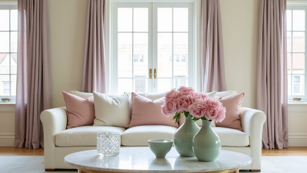
While jewel tones command attention with their intensity, pastels work their magic through whispered elegance. You’ll discover that choosing a pastel accent color creates sophistication without overwhelming your space.
These gentle hues bring refinement that feels effortless:
- Dusty rose pillows on neutral sofas
- Sage green artwork in minimalist frames
- Lavender throws draped over reading chairs
- Powder blue vases on floating shelves
- Soft peach ceramic bowls as coffee table styling
The beauty of pastels lies in their versatility—you can layer multiple shades without creating chaos. Think about how blush pink complements cream walls, or how mint green enhances white trim.
Your guests might not immediately notice these subtle touches, but they’ll feel the elegance. Sometimes the most powerful design choices are the ones that whisper rather than shout.
Warm Colors to Create Cozy and Inviting Atmospheres
When you want your home to feel like a warm hug, nothing beats the power of rich, cozy colors that draw people in and make them want to stay.
Think burnt orange, deep terracotta, or that perfect shade of rust you see in autumn leaves. These warm colors instantly shift the atmosphere from sterile to inviting.
You don’t need to paint entire walls either. Try adding warm amber through throw pillows, blankets, or artwork. A cozy reading nook becomes infinitely more appealing with golden yellows or rich burgundy accents.
Even small touches work wonders. Copper picture frames, warm wood tones, or a single statement piece in deep red can transform how a room feels.
What’s interesting is how these colors actually make spaces feel smaller, but in a good way—more intimate rather than cramped.
Cool Colors for Calming and Spacious Effects

On the flip side, cool colors work like magic for opening up your space and creating that sense of calm you’ve been craving.
Think about how a light color like soft blue instantly makes your space feel bigger. Blues, greens, and purples don’t just look good—they actually trick your eye into perceiving more room than you have.
Here’s what cool accent colors bring to your living room:
- Pale blues that mirror sky and water for instant serenity
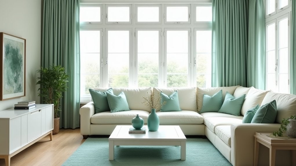
- Sage greens that connect you with nature indoors
- Soft lavenders for gentle visual interest without overwhelming
- Cool grays that pair with almost anything
- Mint greens that feel fresh and airy
You’ll notice these shades naturally recede into the background, which is exactly what smaller rooms need. Cool tones work especially well in bedrooms where relaxation matters most.
Considering Natural and Artificial Lighting Conditions
Since lighting changes everything about how colors appear in your space, you need to test your accent color choices under different conditions before committing. Your room looks completely different at noon versus evening, and that bold blue might turn muddy under warm lamplight.
Place color samples on different walls throughout the day. Notice how morning sunlight affects your choices compared to afternoon shadows. Then check again with your lamps on—you’ll be surprised how much artificial lighting shifts everything.
North-facing rooms get cooler light, while south-facing spaces receive warmer tones. This matters more than you think. Your accent color should work in both scenarios, not just look perfect during that one golden hour when you picked it out.
Incorporating Accent Colors Through Furniture and Accessories

After you’ve nailed down your accent colors in different lighting conditions, furniture becomes your most impactful way to introduce these hues into your space. Start small if you’re hesitant about commitment.
Here are five strategic ways to incorporate pops of color:
- Throw pillows – easily swappable and budget-friendly for seasonal changes
- Accent chairs – statement pieces that anchor your color scheme
- Area rugs – ground the space while adding substantial color coverage
- Artwork and wall decor – vertical interest without major investment
- Lampshades and lighting fixtures – functional accent furniture that glows
Accent chairs work particularly well in corners that need life. You don’t have to match everything perfectly either. Sometimes mixing different shades of your chosen accent color creates more visual interest than strict coordination.
Balancing Multiple Accent Colors Without Overwhelming the Space
While one accent color can transform a room, using multiple accent colors requires a more delicate approach.
Start with two colors that feel complementary rather than competing. You don’t want them fighting for attention across your space. Maybe a soft coral and navy blue, or warm gold paired with deep forest green.
The key is limiting your variety of colors to three maximum. Beyond that, things get chaotic quickly.
Distribute these colors and patterns throughout the room intentionally. Place one accent color on larger pieces like throw pillows or artwork, then use the second more sparingly on smaller accessories.
You’ll want to maintain visual breathing room between colorful elements. Sometimes less really is… well, it just works better than cramming everything in.
Testing Color Combinations Before Making Final Decisions

How can you be sure those beautiful colors you’ve been eyeing will actually work together in your space? Testing prevents costly mistakes and buyer’s remorse.
Start small before committing to major purchases or painting entire walls. You don’t want to choose a color that clashes with your existing furniture.
- Paint large poster boards in your potential colors and move them around the room
- Collect fabric swatches, paint samples, and photographs of furniture pieces
- Use online color palette tools to preview combinations digitally
- Try temporary solutions like removable wallpaper or colorful throw pillows first
- View your samples in different lighting throughout the day
Your secondary color might look perfect in afternoon sunlight but terrible under evening lamps. Vivid colors especially need careful consideration since they’re harder to change later.
Frequently Asked Questions
How Often Should I Change My Accent Colors to Keep up With Trends?
You don’t need to change accent colors frequently to follow trends. Update them every 2-3 years or when you’re tired of your current scheme. Focus on timeless choices that reflect your personal style instead.
What’s the Budget-Friendly Way to Test Accent Colors Before Committing to Expensive Purchases?
You can test accent colors affordably by using removable wallpaper samples, colorful throw pillows, temporary wall decals, or inexpensive artwork. Try painting small furniture pieces or switching out lampshades before investing in major purchases.
Can I Use Different Accent Colors in Connecting Rooms or Open Floor Plans?
You can definitely use different accent colors in connecting spaces, but maintain visual flow by repeating one unifying element like wood tones, metallics, or neutral base colors throughout.
How Do I Choose Accent Colors That Work With My Existing Artwork Collection?
Start by identifying the dominant colors in your favorite pieces. Pull one secondary color from your artwork to use as your main accent. You’ll create cohesion while letting your art remain the focal point.
What Accent Colors Work Best for Small Living Rooms Versus Large Spaces?
In small living rooms, you’ll want lighter accent colors like soft blues or warm yellows to create openness. Large spaces can handle bold, dramatic accents like deep emerald or rich burgundy without overwhelming.
Final Thoughts
You’ve got the tools now to pick accent colors that actually work in your space.
Start small—maybe just one throw pillow or a single piece of art. See how it feels for a week or two before you commit to bigger purchases.
Your lighting will change how colors look throughout the day, so don’t rush the decision.
Trust your instincts, but give yourself time to live with the choices.


