
Forget red and green this year – non-traditional Christmas color schemes can transform your holiday space. Consider the elegant Winter Blush with pink and gold accents, or the dramatic Moody Yuletide‘s deep purple and copper combination. You might love Coastal Christmas‘s seafoam and sand palette for a relaxed vibe, or Alpine Meadow’s sage and cream for serene sophistication. Boho Festive’s mustard and teal brings unexpected warmth, while Metropolitan Glam‘s charcoal and champagne offers modern elegance. These fresh palettes breathe new life into your seasonal decorating.
The Essentials
- Combine pink and gold for a sophisticated Winter Blush palette that creates elegant warmth through metallic accents and soft pink ornaments.
- Deep Purple and Copper creates a moody, luxurious atmosphere perfect for evening gatherings with its regal combination and warm metallic glow.
- Coastal Christmas designs with seafoam, sand, and white incorporate nautical elements like driftwood and sea glass for a beachy holiday feel.
- Boho Festive styling breaks tradition by pairing vibrant mustard with teal accents alongside natural wood elements and handcrafted geometric ornaments.
- Metropolitan Glam uses sophisticated charcoal and champagne tones with contrasting textures to create an urban, modern holiday aesthetic.
Winter Blush: Pink and Gold Elegance
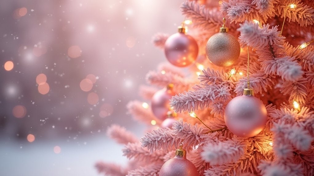
While traditional red and green will always have their place, there’s something undeniably magical about a Winter Blush palette that brings pink and gold together for the holidays.
You’ll find this combination creates a softer, more sophisticated atmosphere that still feels festive. Try adding blush accents to your tree with matte or glittery ornaments in various pink tones. I actually used this palette last year and was surprised by how many compliments I received.
Gold details really make the pink pop—think ribbon, garland, or maybe some metallic candle holders scattered throughout your space. These warmer tones feel cozy but fresh.
What about your gift wrapping? Kraft paper with pink and gold ribbons looks pretty amazing. It’s unexpected but not too out-there for family members who might prefer traditional decor.
Frosted Sapphire: Blue and Silver Combinations
If you’re tired of the same old holiday colors, a Frosted Sapphire palette might be exactly what your Christmas decor needs this year. This striking combination evokes the crisp beauty of winter nights and adds a cool sophistication to your space.
Try layering various shades of blue—from icy pale to deep navy—with reflective silver accents. It works amazingly well for tree ornaments, maybe adding some clear glass baubles to enhance that frosty feel.
Your frosted sapphire décor doesn’t need to be complicated. Even simple blue candles with silver holders can transform a mantel. I’ve found that blue velvet ribbon wrapped around plain packages, topped with silver bows, looks unexpectedly elegant.
What about your table setting? Blue table linens with silver cutlery create a dinner experience that feels wintery yet fresh.
Nordic Minimalism: White and Natural Wood
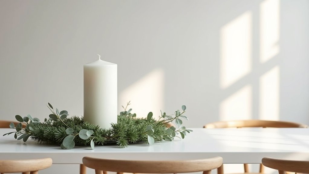
Moving beyond the sparkle of blue and silver, Nordic Minimalism strips Christmas decor down to its purest essence. This style embraces white accents paired with natural wood elements—creating spaces that feel both crisp and incredibly warm at the same time.
You’ll find Nordic decor surprisingly versatile. Try arranging simple white candles on a raw wood mantel, or maybe scatter pine branches across a pale table runner. The minimalist charm comes from what you leave out, not what you add.
Natural textures are key here. Think wool throws, bare wooden ornaments, and linen stockings in cream tones. I’ve found this approach creates such a cozy ambiance without the visual noise of traditional decorations.
The functional beauty of Nordic design celebrates seasonal simplicity. It’s winter’s quiet elegance brought indoors—don’t you think that’s invigorating?
Coastal Christmas: Seafoam, Sand and White
The seaside offers a invigorating departure from traditional holiday décor, just as Nordic simplicity does from conventional Christmas excess. You might find yourself drawn to the calm palette of seafoam greens, sandy beiges, and crisp whites that echo the shoreline’s natural beauty.
Try incorporating driftwood as a tree base or mantel decoration. Maybe add some nautical ornaments – think tiny glass floats, starfish, and shells collected from summer trips. I’ve found that stringing white lights through a piece of driftwood creates this amazing, soft glow that reminds me of foggy mornings by the ocean.
Coastal accents like rope-wrapped candles or sea glass vases bring authenticity without feeling themed or overdone. What memories of the shore could you weave into your holiday space?
Moody Yuletide: Deep Purple and Copper
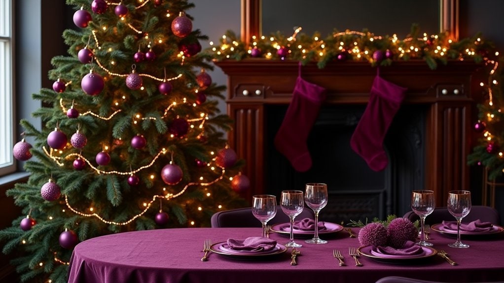
You’ll transform your home into a mysterious winter sanctuary when you pair the regal depth of purple with copper’s warm metallic glow. This unexpected combination brings a touch of royal elegance that’s perfect for those who want Christmas décor that feels both luxurious and slightly unconventional. The rich purple evokes mystical winter nights, while copper accents catch the light in ways that traditional gold or silver just can’t match.
Royal Elegance Reimagined
When traditional reds and greens feel predictable, deep purple and copper offer a sophisticated alternative that captures the essence of holiday luxury. You’ll find these colors bring warmth and mystery to your seasonal décor while maintaining that festive spirit you’re after.
Try layering regal accents throughout your space—copper candlesticks catching the light, deep purple velvet ribbons draped across your mantel. I’ve found that mixing opulent textures really makes this palette sing. Think plush purple throws against copper-threaded pillows.
What makes this combination work so well? Maybe it’s how the colors feel both modern and timeless. Last year, I transformed my dining room with purple tapers in copper holders and honestly, the compliments wouldn’t stop. It’s unexpected but still feels like Christmas—just more grown-up and, well, yours.
Mystical Winter Nights
Venturing beyond traditional holiday palettes, mystical winter nights call for deeper, more contemplative colors that mirror the long December darkness. Deep purples paired with copper accents create an almost otherworldly ambiance in your home—something I’ve always found intriguing.
Try draping copper string lights against purple velvet ribbon on your mantel. You’ll transform ordinary spaces into mystical settings that feel both luxurious and slightly mysterious.
You know what’s interesting? These colors actually work better in rooms with less natural light. I found this out when decorating my study last year. The enchanting decorations seemed to glow more intensely as evening fell.
What about copper ornaments against a deep purple tree? It’s unexpected and creates this warm, intimate feeling that might just become your new holiday tradition.
Modern Monochrome: Black and White Statements
You’ll find that a black and white Christmas scheme delivers serious drama without the fuss of traditional reds and greens. Try pairing matte black ornaments with crisp white lights, or maybe wrap presents in stark monochrome papers with textured ribbons for that perfect contrast. The beauty of this minimalist approach is how it lets your home’s architecture shine through, creating a modern holiday statement that feels both timeless and unexpectedly fresh.
Dramatic Minimalist Décor
For those seeking a departure from traditional Christmas exuberance, a black and white monochrome palette offers striking sophistication that’s anything but boring.
You’ll find that bold statement pieces create powerful focal points without the clutter. Try a matte black Christmas tree adorned with just a few strategic minimalist ornaments in contrasting white. Maybe a single oversized paper star hanging in the window?
I’ve noticed how this approach actually makes your space feel more intentional. Last year, I paired stark white candles with black holders on my mantel, and honestly, the effect was stunning.
Don’t forget about texture—it’s what keeps monochrome from falling flat. Mix velvet, metal, and wood elements to add depth while maintaining your sleek aesthetic. What unexpected materials might you incorporate?
Chic Textural Contrasts
The magic of a black and white Christmas palette truly comes alive when you layer different textures against each other. It’s the chic layering of materials that creates depth in what could otherwise feel stark. You’ll find the monochrome scheme actually lets you play more with surfaces—matte against glossy, rough against smooth.
For maximum textural variety, try incorporating:
- Fuzzy white sheepskin throws draped over black metal chairs
- Matte black ceramic ornaments mixed with mercury glass
- Crisp white linen napkins against black slate placemats
- Handmade paper snowflakes hanging from black velvet ribbons
I’ve found that when working with just two colors, you need these contrasts to keep things interesting. Maybe add a single metallic accent—silver or gold—if you want just a hint of festive sparkle without breaking your scheme.
Rustic Terracotta: Earthy Orange and Bronze
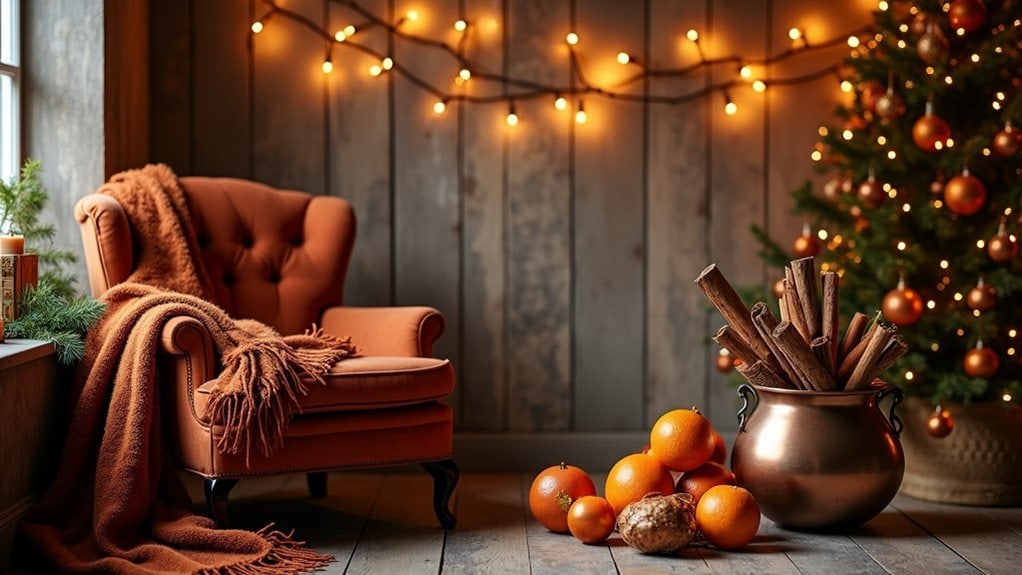
Warmth radiates from a rustic terracotta palette, bringing earthy elegance to holiday decorating that feels both grounding and unexpected. You’ll find this combination shifts Christmas traditions into something more personal, maybe even connecting to the surroundings around you.
Mix deep orange-browns with subtle bronze accents on your mantel or table settings. I’ve noticed these colors work beautifully with natural materials—pinecones, dried orange slices, cinnamon sticks—really enhancing that rustic charm we’re all drawn to lately.
Try incorporating earthy elements through textured ceramics or clay ornaments. They don’t need to be perfect. Actually, the handmade quality adds authenticity to your space. What about terracotta pots filled with evergreen branches and topped with bronze candleholders? The warm glow against those rich colors creates an inviting atmosphere that’s festive but not overdone.
Alpine Meadow: Sage Green and Cream
While earthiness brings character through terracotta, shifting to sage green and cream creates an entirely different mood for your holiday space. This nature inspired arrangement evokes the tranquility of snow-dusted fir trees and pristine winter scenery. You’ll find yourself drawn to the subtle sophistication that comes from these softer, cooler tones.
Add cozy alpine accents throughout your home with:
- Cream-colored woolen stockings with sage trim
- Eucalyptus garlands draped across mantels or stair railings
- Matte sage ornaments clustered with pinecones and cream ribbons
- White ceramic deer figurines placed among sage green candles
I think this palette works especially well in homes with lots of natural light. The gentle contrast feels fresh yet timeless, and won’t compete with the natural greenery you might already have around. Maybe try it first in a smaller space to see how you connect with it.
Metropolitan Glam: Charcoal and Champagne
You’ll find that charcoal and champagne create a timeless urban sophistication that’s perfect for modern holiday décor—think sleek city apartments with floor-to-ceiling windows on snowy evenings. Try layering different textures within this palette: matte charcoal walls against glossy champagne ornaments, or perhaps velvet pillows next to metallic accents that catch your candlelight. When you’re working with such a refined color scheme, it’s often the contrast between rough and smooth surfaces that brings your space to life, rather than the traditional holiday glitter and shine.
Timeless Urban Sophistication
For sophistication that transcends seasonal trends, charcoal and champagne create a metropolitan Christmas palette that feels both modern and timeless. You’ll notice how these understated hues bring urban chic to your holiday décor without the predictable red and green overload. I’ve seen spaces transformed—a friend’s loft looked absolutely stunning with matte charcoal walls and champagne metallic accents last December.
- Textured charcoal throw pillows against cream furniture create depth
- Champagne-tinted string lights reflect beautifully against dark surfaces
- Mercury glass ornaments in smoky gray and pearl tones for tree décor
- Metallic gift wrap with black velvet ribbons for modern elegance
Want to make it feel warmer? Maybe add just a touch of blush or copper. These tones work year-round too, so you’re basically investing in your space beyond the holidays.
Layered Texture Techniques
Texture becomes the secret weapon in metropolitan glam holiday décor, transforming flat surfaces into dimensional masterpieces that catch both light and attention. You’ll want to mix textured ornaments in varying sizes—think matte charcoal baubles nestled against glossy champagne spheres with subtle ribbing or geometric patterns.
Don’t stop at the tree! Try layered fabrics throughout your space. Drape a chunky knit throw over velvet pillows or place a sequined table runner atop a linen tablecloth. The contrast creates depth that’s honestly more interesting than traditional Christmas décor.
I’ve found that metallic elements really pop against textured backgrounds. Maybe try placing mercury glass candleholders on a nubby charcoal table runner? The interplay between rough and smooth surfaces creates a sophisticated tension that elevates your holiday aesthetic without trying too hard.
Candy Wonderland: Mint and Lavender
Two delightful shades transform the traditional Christmas palette into a whimsical candy wonderland when you pair mint and lavender together. You’ll create a dreamlike quality that feels both fresh and nostalgic at once. Try placing mint decorations on your mantel with small lavender accents scattered throughout—this creates a cohesive look without feeling too planned.
- Frosted mint baubles hanging from white branches with tiny lavender ribbons
- Pastel-colored wrapped candies in glass jars as table centerpieces
- Mint green stockings with lavender trim and white pom-poms
- Gradient candles that shift from lavender to mint as they burn down
The key is balance. You don’t want too much of either color. I’ve found that adding cream or white backgrounds makes the mint and lavender pop even more effectively.
Boho Festive: Mustard and Teal Accents
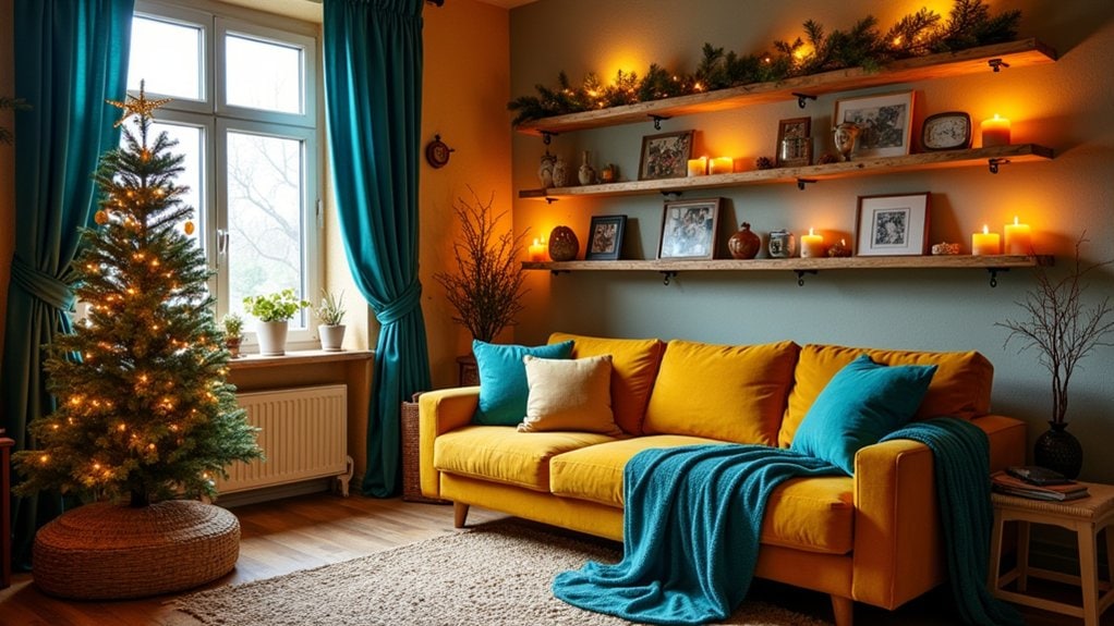
While pastels create a dreamy holiday atmosphere, bolder combinations offer a completely different festive vibe. I’ve been really drawn to mustard and teal lately—they bring this amazing bohemian energy to Christmas decorating that breaks all the traditional rules.
Try hanging teal garlands across your mantel or staircase, then mix in mustard-colored candles or throw pillows. The contrast is striking but somehow feels really balanced. I found these handcrafted boho ornaments last year with geometric patterns in these colors, and honestly, they’ve transformed my tree.
You might think these colors would clash with Christmas, but they actually create this warm, cozy space that feels both festive and uniquely yours. Maybe add some natural wood elements to ground the palette? The earthy-meets-jewel-tone vibe feels perfectly imperfect.
Midnight Forest: Navy and Emerald Pairings
When deep navy meets rich emerald in holiday decorating, magic happens in the shadows. This pairing feels sophisticated yet festive, without screaming “Christmas!” You’ll find the combination creates depth that traditional red and green can’t match. Navy accents against emerald textures create a luxurious woodland vibe that transforms your space into something truly special.
- Try navy velvet ribbons wrapped around an emerald-toned tree
- Add gold or copper accessories to brighten the rich, dark palette
- Layer emerald textures through pillows, throws, and table runners
- Incorporate natural elements like pine cones with navy-painted tips
I think this palette works best in spaces with good lighting—maybe add some strategic candles to highlight the interplay between these deep tones. You’ll be surprised how cozy yet elegant your home feels with this midnight forest theme.
Scandinavian Simplicity: Gray and Pale Yellow
The gentle aesthetic of Scandinavian design brings a revitalizing alternative to Christmas decorating through its gray and pale yellow palette. You’ll find this combination creates spaces that feel both festive and peaceful, without the visual noise of traditional holiday colors.
Try pairing light gray walls with pale yellow accents in your minimalist holiday setup. Wooden ornaments, linen table runners, and maybe a few carefully placed candles are all you need. I’ve noticed Scandinavian decor works best when you embrace negative space—let your home breathe a little.
Natural materials really shine in this palette. Birch logs, wool throws, and ceramic dishes in these soft hues create a cohesive look that’s welcoming without overwhelming. Don’t you think there’s something freeing about stepping away from red and green expectations?
Frequently Asked Questions
How Do I Introduce Non-Traditional Colors Without Alienating Traditional-Minded Family Members?
You’ll win over traditional family members by easing in non-traditional colors alongside classic ones. Understanding color psychology helps—explain how new hues complement, not replace, cherished family traditions they already love.
Which Non-Traditional Color Schemes Work Best for Small Apartment Spaces?
For small apartments, you’ll find jewel-toned purples with silver create bold combinations that don’t overwhelm. Try blush pink with copper for warmth, or teal with gold cozy accents that enhance visual space while feeling festive.
Are There Specific Lighting Options That Enhance These Alternative Color Palettes?
You’ll enhance alternative palettes with strategic ambient lighting choices. Warm color temperature bulbs complement jewel tones, while cool LEDs elevate silver-blue schemes. Dimmable options let you adjust intensity for different moods.
How Can I Transition These Color Schemes for Post-Holiday Winter Decor?
You’ll find winter decor shifts easy by removing overtly Christmas elements while keeping metallic accents, cool blues, and neutrals. Add cozy textures and natural elements for seasonal shifts that carry your color scheme through February.
What Non-Traditional Christmas Colors Are Trending for Upcoming Holiday Seasons?
You’ll see emerald green, blush pink, and navy blue trending this holiday season. They’re complemented by metallic gold accents, deep plum statements, and soft gray backgrounds for a sophisticated, non-traditional Christmas palette.
Final Thoughts
You’ve got so many options beyond red and green! I’d try that Winter Blush palette myself—something about pink and gold feels festive but fresh. Remember, your Christmas colors can reflect your personal style, not just tradition. Maybe start small with new accent pieces in these alternative palettes. What matters most is creating a space that makes you happy during the holidays. Which palette speaks to you?