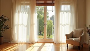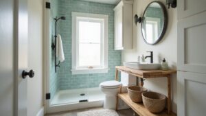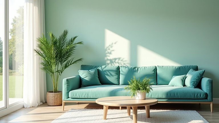
If your room feels stuffy even with the AC running, color might be part of the problem. The shades on your walls, furniture, and accents actually affect how warm or cool a space feels — not just visually, but psychologically. It’s a small shift that makes a real difference. So which colors actually work, and how do you use them without ending up with a room that feels cold or flat?
The Essentials
- Blues, soft greens, and muted gray with blue undertones psychologically lower perceived room temperature without changing the thermostat.
- Room-specific palettes work best: dusty blue for bedrooms, pale aqua for kitchens, and icy hues for living rooms.
- Warm accent colors like terracotta or mustard yellow contrast cool walls without eliminating the refreshing, airy atmosphere.
- Layering textures and mixing cool shades prevents flatness, keeping spaces visually dynamic while maintaining a temperature-lowering effect.
- Simple swaps like cool-toned rugs, lampshades, or textiles can significantly shift a room’s perceived temperature affordably.
The Colors That Actually Make Rooms Feel Cooler
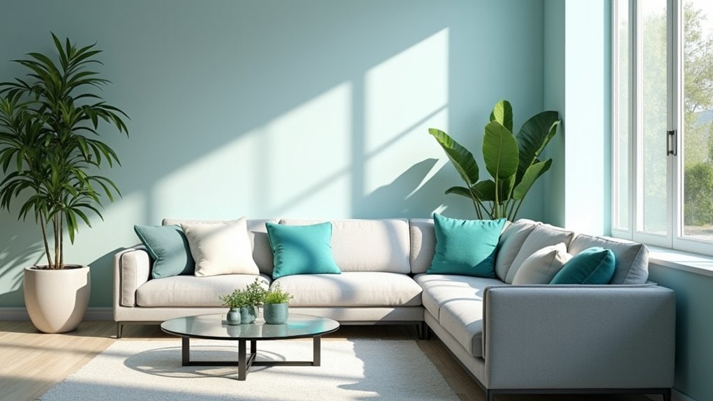
There are a handful of colors that genuinely make a room feel cooler, and it’s not just about aesthetics. Color psychology tells us that your brain responds to certain hues before you’re even conscious of it.
Blues, soft greens, and muted grays with blue undertones tend to lower your perceived room temperature. Not dramatically, but noticeably.
Think about how natural light interacts with your walls throughout the day. A pale aqua reads differently at noon than at 7pm.
Texture contrasts matter too. A cool-toned wall paired with linen or matte surfaces reinforces that calm, lower-temperature feeling. Mood enhancement isn’t accidental here — it’s intentional layering.
Seasonal trends push warmer palettes constantly, but don’t feel pressured. What actually makes you feel comfortable in your space?
Cool Color Palettes for Every Room in the House
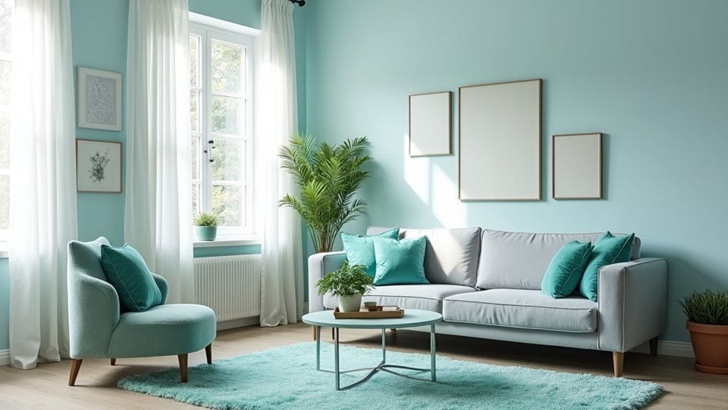
Now that you know which colors actually work, let’s talk about putting them into specific rooms — because a color that feels perfect in a bedroom might fall completely flat in a kitchen.
In bedrooms, lean into serene shades and tranquil spaces — soft sage, dusty blue, or muted tones that don’t demand attention.
Kitchens respond well to fresh accents and subtle contrasts. Think crisp white with a pale aqua backsplash.
Living rooms? Airy designs work here. Icy hues on walls paired with natural textures keep things grounded.
Bathrooms practically beg for coastal vibes — it just makes sense.
And don’t overlook hallways. Soft, flowing shades with subtle contrasts can actually shift how the whole house feels temperature-wise. Worth experimenting with.
The Best Accent Colors to Pair With Cool Palettes
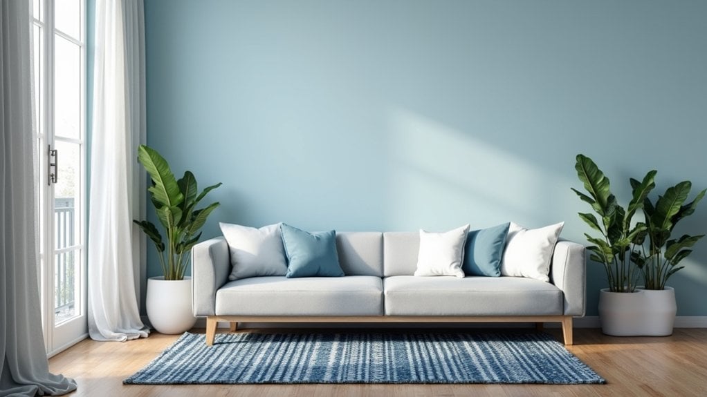
Choosing a few accent colors to work alongside your cool palette can honestly make or break the whole look.
Accent Color Combinations don’t have to be complicated. Think about what you’re actually drawn to. A warm terracotta pillow against a slate blue wall? That Contrasting Warmth creates tension in a good way—it stops the room from feeling flat or cold.
Mustard yellow works surprisingly well with cool greens. Burnt orange alongside muted teal. Even a deep rust tone can pull a room together without overwhelming it.
But here’s something worth asking yourself—how much warmth do you actually want in the space? One or two accent pieces might be enough.
You don’t need a perfect formula. Just trust what feels balanced to you.
How to Use Cool Colors Without Making a Room Feel Flat
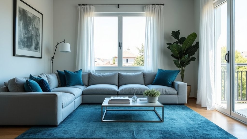
Cool colors can absolutely flatten a room if you’re not careful about how you layer them. Color psychology tells us that cooler tones naturally recede visually, which creates depth but can also drain energy from a space if you lean too hard into them.
So what do you do?
Texture balance is honestly your best tool here. Think rough linen against a smooth painted wall, or a chunky knit throw on a sleek sofa. The contrast keeps your eye moving.
You should also mix in varying shades—a pale blue beside a deeper teal reads as more vibrant than one flat tone repeated everywhere.
Does your room have enough natural light? That matters more than most people realize. Without it, cool colors tend to look heavy rather than calm.
Small Swaps That Introduce Cool Color Palettes Into Any Room
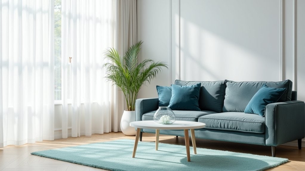
If you’re not ready to repaint or commit to a full redesign, small swaps can still shift the whole feel of a room.
Start with textile choices. Swap out warm-toned throw pillows or curtains for something in sage, dusty blue, or soft gray. It’s a low-commitment change that actually works.
Paint finishes matter too, maybe more than you’d expect. A cool-toned trim in a matte or eggshell finish can quietly change how warm or neutral a room reads.
Think about what you already have. Could a rug swap do the work here? Or even just changing a lampshade?
You don’t have to overhaul everything. Sometimes one or two well-placed cool tones are honestly enough to make a room feel noticeably different.
Frequently Asked Questions
Do Cool Color Palettes Affect Energy Bills or Room Temperature Physically?
Cool color palettes don’t physically lower your room’s temperature or cut energy bills. They do enhance your temperature perception, creating an illusion of coolness. For real energy savings, you’ll need proper insulation, ventilation, or air conditioning solutions.
Can Cool Color Palettes Work Well in Rooms With No Natural Light?
Yes, cool color palettes can work in rooms without natural light, but you’ll need to carefully consider artificial lighting. Warm bulbs can counteract the effect, so you should choose lighting that enhances room perception and maintains a revitalizing atmosphere.
Are Cool Color Palettes Considered Timeless or Just a Passing Trend?
Cool color palettes carry timeless appeal, so you don’t need to worry about them fading out. Trend analysis shows they’ve decorated spaces for centuries, and you’ll find they’re always invigorating, sophisticated choices for your home.
How Do Cool Color Palettes Impact Mood or Mental Well-Being Long-Term?
Living with cool color palettes long-term positively shapes your emotional response through color psychology. You’ll notice improved calm, better spatial perception, and sustained design harmony that continuously nurtures your mental well-being, reducing stress effectively.
Do Cool Color Palettes Affect How Large Furniture Pieces Appear in Rooms?
Yes, cool color palettes can make large furniture proportions appear smaller and more balanced. They create visual depth, causing pieces to recede into the background, so you’ll notice your room feels more open and spacious.
Final Thoughts
You don’t need to overhaul your whole space to make it feel cooler. A few intentional color choices — a slate blue wall, some muted green textiles — can genuinely shift how a room feels. It’s worth experimenting, honestly. Maybe start with one room, see how it sits with you. Cool palettes aren’t a perfect fix, but they’re a pretty low-effort way to make your home feel a little more livable when it’s hot out.